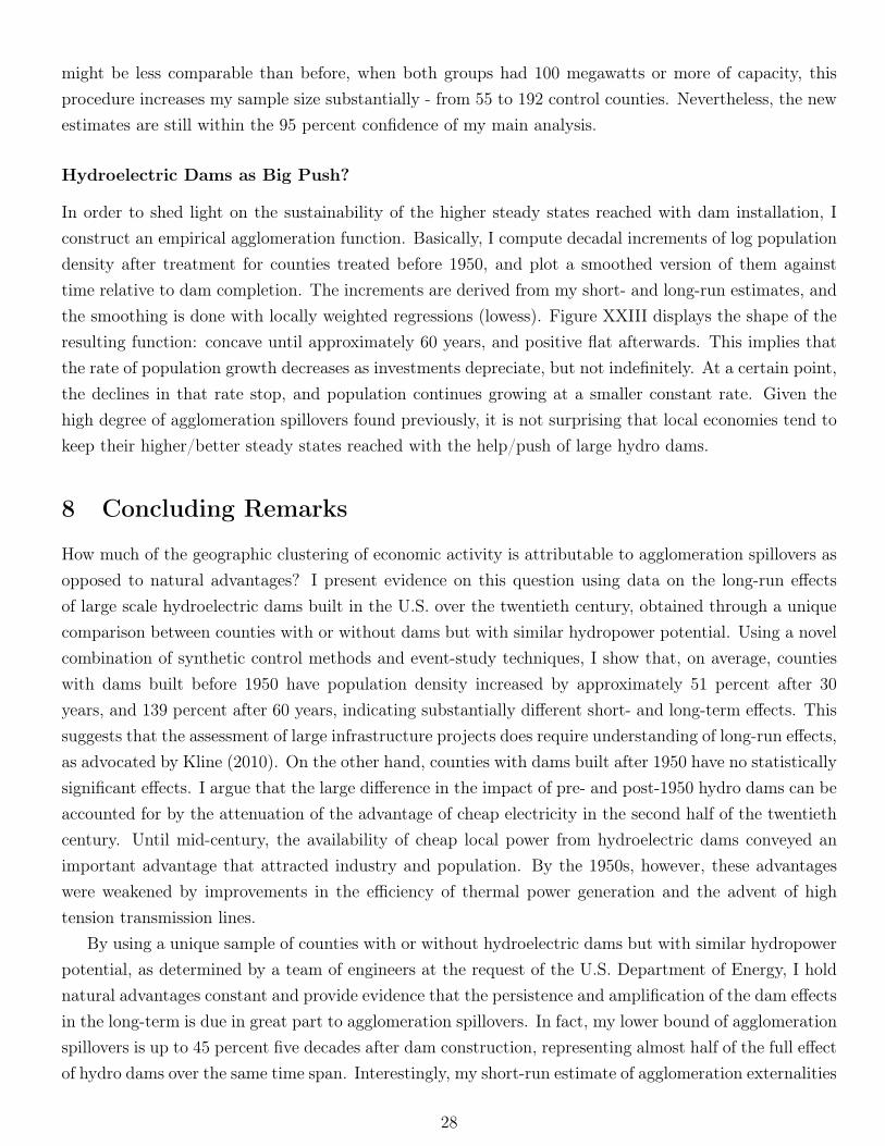
econstor www.econstor.eu Der Open-Access-Publikationsserver der ZBW – Leibniz-Informationszentrum Wirtschaft The Open Access Publication Server of the ZBW – Leibniz Information Centre for Economics Standard-Nutzungsbedingungen: Die Dokumente auf EconStor dürfen zu eigenen wissenschaftlichen Zwecken und zum Privatgebrauch gespeichert und kopiert werden. Sie dürfen die Dokumente nicht für öffentliche oder kommerzielle Zwecke vervielfältigen, öffentlich ausstellen, öffentlich zugänglich machen, vertreiben oder anderweitig nutzen. Sofern die Verfasser die Dokumente unter Open-Content-Lizenzen (insbesondere CC-Lizenzen) zur Verfügung gestellt haben sollten, gelten abweichend von diesen Nutzungsbedingungen die in der dort genannten Lizenz gewährten Nutzungsrechte. Terms of use: Documents in EconStor may be saved and copied for your personal and scholarly purposes. You are not to copy documents for public or commercial purposes, to exhibit the documents publicly, to make them publicly available on the internet, or to distribute or otherwise use the documents in public. If the documents have been made available under an Open Content Licence (especially Creative Commons Licences), you may exercise further usage rights as specified in the indicated licence. zbw Leibniz-Informationszentrum Wirtschaft Leibniz Information Centre for Economics Severnini, Edson R. Working Paper The Power of Hydroelectric Dams: Agglomeration Spillovers IZA Discussion Paper, No. 8082 Provided in Cooperation with: Institute for the Study of Labor (IZA) Suggested Citation: Severnini, Edson R. (2014) : The Power of Hydroelectric Dams: Agglomeration Spillovers, IZA Discussion Paper, No. 8082 This Version is available at: http://hdl.handle.net/10419/96760
Transcript
econstor www.econstor.eu
Der Open-Access-Publikationsserver der ZBW – Leibniz-Informationszentrum WirtschaftThe Open Access Publication Server of the ZBW – Leibniz Information Centre for Economics
Standard-Nutzungsbedingungen:
Die Dokumente auf EconStor dürfen zu eigenen wissenschaftlichenZwecken und zum Privatgebrauch gespeichert und kopiert werden.
Sie dürfen die Dokumente nicht für öffentliche oder kommerzielleZwecke vervielfältigen, öffentlich ausstellen, öffentlich zugänglichmachen, vertreiben oder anderweitig nutzen.
Sofern die Verfasser die Dokumente unter Open-Content-Lizenzen(insbesondere CC-Lizenzen) zur Verfügung gestellt haben sollten,gelten abweichend von diesen Nutzungsbedingungen die in der dortgenannten Lizenz gewährten Nutzungsrechte.
Terms of use:
Documents in EconStor may be saved and copied for yourpersonal and scholarly purposes.
You are not to copy documents for public or commercialpurposes, to exhibit the documents publicly, to make thempublicly available on the internet, or to distribute or otherwiseuse the documents in public.
If the documents have been made available under an OpenContent Licence (especially Creative Commons Licences), youmay exercise further usage rights as specified in the indicatedlicence.
zbw Leibniz-Informationszentrum WirtschaftLeibniz Information Centre for Economics
Severnini, Edson R.
Working Paper
The Power of Hydroelectric Dams: AgglomerationSpillovers
IZA Discussion Paper, No. 8082
Provided in Cooperation with:Institute for the Study of Labor (IZA)
Suggested Citation: Severnini, Edson R. (2014) : The Power of Hydroelectric Dams:Agglomeration Spillovers, IZA Discussion Paper, No. 8082
This Version is available at:http://hdl.handle.net/10419/96760
DI
SC
US
SI
ON
P
AP
ER
S
ER
IE
S
Forschungsinstitut zur Zukunft der ArbeitInstitute for the Study of Labor
The Power of Hydroelectric Dams:Agglomeration Spillovers
Any opinions expressed here are those of the author(s) and not those of IZA. Research published in this series may include views on policy, but the institute itself takes no institutional policy positions. The IZA research network is committed to the IZA Guiding Principles of Research Integrity. The Institute for the Study of Labor (IZA) in Bonn is a local and virtual international research center and a place of communication between science, politics and business. IZA is an independent nonprofit organization supported by Deutsche Post Foundation. The center is associated with the University of Bonn and offers a stimulating research environment through its international network, workshops and conferences, data service, project support, research visits and doctoral program. IZA engages in (i) original and internationally competitive research in all fields of labor economics, (ii) development of policy concepts, and (iii) dissemination of research results and concepts to the interested public. IZA Discussion Papers often represent preliminary work and are circulated to encourage discussion. Citation of such a paper should account for its provisional character. A revised version may be available directly from the author.
Spillovers* How much of the geographic clustering of economic activity is attributable to agglomeration spillovers as opposed to natural advantages? I present evidence on this question using data on the long-run effects of large scale hydroelectric dams built in the U.S. over the 20th century, obtained through a unique comparison between counties with or without dams but with similar hydropower potential. Until mid-century, the availability of cheap local power from hydroelectric dams conveyed an important advantage that attracted industry and population. By the 1950s, however, these advantages were attenuated by improvements in the efficiency of thermal power generation and the advent of high tension transmission lines. Using a novel combination of synthetic control methods and event-study techniques, I show that, on average, dams built before 1950 had substantial short run effects on local population and employment growth, whereas those built after 1950 had no such effects. Moreover, the impact of pre-1950 dams persisted and continued to grow after the advantages of cheap local hydroelectricity were attenuated, suggesting the presence of important agglomeration spillovers. Over a 50 year horizon, I estimate that at least one half of the long run effect of pre-1950 dams is due to spillovers. The estimated short and long run effects are highly robust to alternative procedures for selecting synthetic controls, to controls for confounding factors such as proximity to transportation networks, and to alternative sample restrictions, such as dropping dams built by the Tennessee Valley Authority or removing control counties with environmental regulations. I also find small local agglomeration effects from smaller dam projects, and small spillovers to nearby locations from large dams. JEL Classification: N92, R11, R12, Q42 Keywords: hydroelectric dams, agglomeration spillovers, employment growth,
event-study analysis with synthetic control methods Corresponding author: Edson R. Severnini Carnegie Mellon University 4800 Forbes Ave Pittsburgh, PA 15213 USA E-mail: [email protected] * I am extremely grateful to David Card, Patrick Kline and Enrico Moretti for invaluable guidance and support throughout the duration of this project. I also thank Ana Rute Cardoso, Mayssa Dabaghi, Monica Deza, Frederico Finan, Willa Friedman, Francois Gerard, Tadeja Gracner, Hedvig Horvath, Brian Kovak, Attila Lindner, Tarso Mori Madeira, Joana Naritomi, Valentina Paredes, Markus Pelger, Michaela Pagel, Issi Romem, Michel Serafinelli, Lowell Taylor, Reed Walker, and seminar participants at UC Berkeley, Carnegie Mellon University, London School of Economics, Toulouse School of Economics, NBER Summer Institute 2013 - Development of the American Economy (DAE), AEA Annual Meeting 2014, 8th Meeting of the Urban Economics Association, George Washington University, Case Western Reserve University, University of Calgary, World Bank, Inter-American Development Bank, Pontifical Catholic University of Rio de Janeiro (PUC-Rio), Getulio Vargas Foundation (EPGE), Brazilian Econometric Society 35th Annual Meeting, and Cornerstone Research for useful comments. I acknowledge generous support from the Center for Labor Economics at UC Berkeley.
Economic activity is geographically concentrated (e.g., Ellison and Glaeser, 1997, 1999; Duranton andOverman 2005, 2008; Ellison, Glaeser and Kerr, 2010; and Moretti, 2011). However, the mere occurrenceof agglomeration does not imply the existence of agglomeration spillovers. The location of economicagents in space might be due to agglomeration economies (increasing returns, knowledge spillovers, andpooling of specialized skills) and/or natural advantages (topography, climate, and resource endowments).Although there is recent evidence that locational choices are not uniquely determined by fundamentals(e.g., Redding, Sturm, and Wolf, 2011; Bleakley and Lin, 2012; and Kline and Moretti, 2014), influentialstudies have found a major role for natural advantages by examining growth in the aftermath of warbombing (e.g., Davis and Weinstein, 2002, 2008; Brakman, Garretsen and Schramm, 2004; and Migueland Roland; 2011). Despite significant losses during war, bombed cities almost all returned to theirprewar growth paths. In this paper, I present new evidence on the importance of agglomeration spilloversin population density by keeping natural advantages constant1, and evaluate whether such spillovers arestrong enough to generate long-run effects. Instead of bombing, I use installation of large hydroelectricdams in the U.S. in the first half of the twentieth century.
Throughout my analysis, I use a unique database of U.S. counties with similar natural endowmentsassociated with comparable suitability for hydroelectric projects. In the 1990s, a team of engineers deter-mined the hydropower potential across the nation at the request of the U.S. Department of Energy. Thus,natural advantages are arguably held constant. I define counties with hydroelectric dams as "treated"counties, and combinations of counties with no dams but with hydropower potential as counterfactuals,or "synthetic control" counties. To identify agglomeration spillovers, I build on Bleakley and Lin (2012)and rely on the expansion of the electrical grid around 1950, and the consequent attenuation of the cheaplocal power (CLP) advantage brought about by the development of hydro projects in the first half of thetwentieth century2.
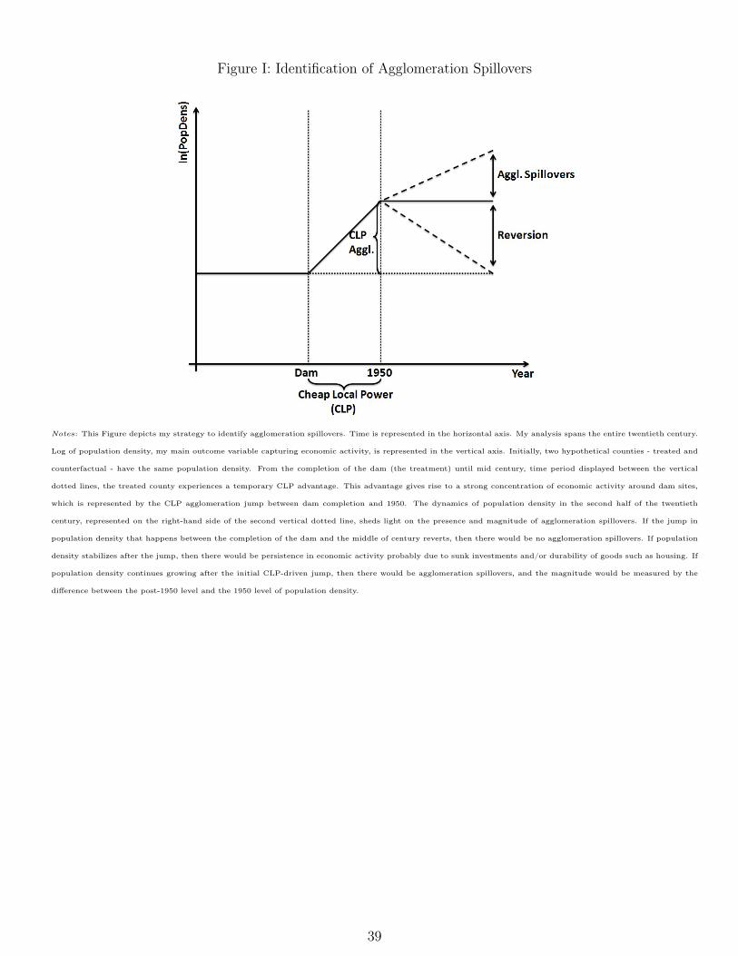
Figure I depicts my identification strategy more clearly. Time is represented in the horizontal axis.My analysis spans the entire twentieth century. Log of population density, my main outcome variablecapturing economic activity, is represented in the vertical axis. Suppose that two counties - treated andcounterfactual - have the same population density up to the construction of a hydroelectric dam. Fromthe completion of the dam until mid century, time period displayed between the two vertical dottedlines, the treated county experiences a temporary CLP advantage. I argue that counties hosting dams inthe first half of the century have a temporary advantage because of the local availability of cheap power.Indeed, I provide suggestive evidence that electricity prices were approximately 45 percent lower in treatedcounties. Electricity transmission networks used to transmit power efficiently only around dam sites beforethe advent of modern high-tension transmission lines. Also, the competing technology of thermal powergeneration was not advanced enough to face the low-generating costs of hydroelectric turbines. That
1Rosenthal and Strange (2004) argue that the agglomeration effects found in the literature should be interpreted asupper bound estimates of agglomeration economies. They point out that those estimates most likely include the influenceof natural advantages.
2Bleakley and Lin (2012) use a fading locational advantage - obsolescence of portage sites - to examine the role of pathdependence in the spatial distribution of economic activity the U.S.
2
CLP advantage gives rise to a strong concentration of economic activity around dam sites, representedby the CLP agglomeration jump between dam completion and 1950 in the Figure. In the second halfof the century, technological improvements in thermal power generation make fossil fuels (mostly coaland natural gas) and nuclear energy almost as competitive as hydropower in producing electricity. Inaddition, the construction of high-voltage transmission lines weakens the need of power generation nextto consumers. Therefore, the appeal of local cheap hydroelectricity reduces considerably after 1950.
The dynamics of population density in the second half of the twentieth century, represented on theright-hand side of the second vertical dotted line in Figure I, sheds light on the presence and magnitudeof agglomeration spillovers. If the jump in population density that happens between the completion ofthe dam and the middle of century reverts, then there would be no agglomeration spillovers, and theevidence would be similar to that of most cities bombed during wars. If population density stabilizes afterthe jump, then there would be persistence in economic activity probably due to sunk investments and/ordurability of goods such as housing. Now, if population density continues growing after the initial CLP-driven jump, then there would be agglomeration spillovers, and the magnitude would be measured by thedifference between the post-1950 level and the 1950 level of population density. My empirical analysisshows evidence of reversion, stabilization and agglomeration spillovers for individual U.S. counties withhydroelectric dams, but the average result indicates the presence of large agglomeration spillovers.
There is some evidence that infrastructure projects such as hydroelectric dams may affect local eco-nomic activity for a long time (e.g., Kline and Moretti, 2014). Besides raising the stock of capital, publicinfrastructure may increase local productivity directly. Also, hydro projects might promote the devel-opment of certain areas permanently because of the amenities that they provide. Recreational actitiviesaround reservoirs are a good example. In order to eliminate these confounding factors from my estimatesof agglomeration spillovers, I subtract any effects of hydro dams built after 1950. Therefore, my ulti-mate measure of spillovers is the growth in population density of counties with pre-1950 dams over andabove the growth of counties with post-1950 dams, in post-1950 years, when the advantage of cheap localelectricity is attenuated3. Although this procedure refines my identification of spillovers, it removes anypotential agglomeration effects of post-1950 dams. In this sense, my estimate represents a lower bound ofagglomeration spillovers.
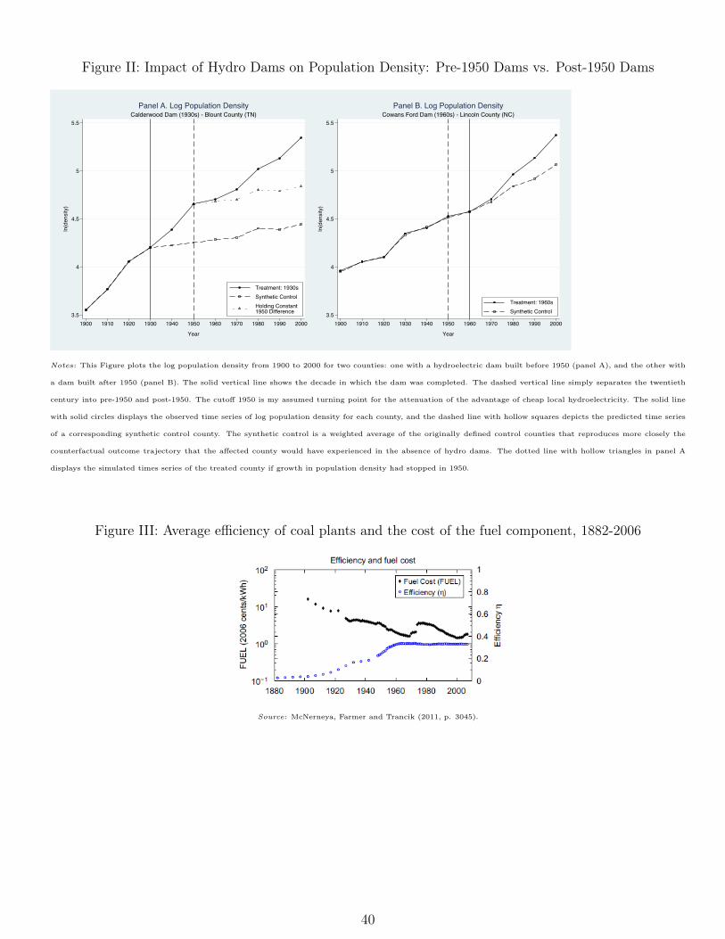
To illustrate my approach, Figure II plots the log population density from 1900 to 2000 for two counties:one with a hydroelectric dam built before 1950, and the other with a dam built after 1950. The solidline with solid circles displays the observed time series of log population density for each county, and thedashed line with hollow squares depicts the predicted time series of a counterfactual county. I explain theprocedure to find a counterfactual in the next paragraph. The left chart, for Blount County, Tennessee,shows a high degree of agglomeration after the construction of the Calderwood Dam, in the 1930s. Thereis also clear evidence of agglomeration spillovers, over and above the agglomeration accumulated until1950 (dotted line with hollow triangles), which one could see as arising solely from the advantage of cheaplocal hydroelectricity in the first half of the twentieth century. In addition, there seems to be strong
3This is related to Greenstone, Hornbeck and Moretti’s (2010) strategy to identify agglomeration economies. Theyexamine whether attracting a Million Dollar Plant (MDP) leads to increases in total factor productivity (TFP) of incumbentmanufacturing plants, over and above the mechanical effect of the new plant on the TFP of the winning county.
3
evidence of path dependence. While the local economic advantage of nearby hydroelectricity is decreasingin the second half of the century, population density is still increasing. It is fair to say that the trendflattens out after 1950, but the upward slope is still unequivocally positive. The right chart, for LincolnCounty, North Carolina, depicts a low degree of agglomeration, even right after the installation of theCowans Ford Dam, in the 1960s, when increases in the stock of capital were still recent. As mentionedabove, this feature of the data helps to strengthen the interpretation of the effects of pre-1950 dams inpost-1950 years as agglomeration spillovers. Though less extreme, I find similar patterns for the impactof a broad sample of large hydroelectric dams on the economic activity of U.S. counties.
To obtain average estimates of agglomeration spillovers, I need credible impact estimates of hydro-electric dams. Despite the number of large hydro dams in the U.S. - 185 dams with a capacity of 100megawatts or more - there is surprisingly little research on their local economic impacts. Hence, in thispaper, I also present the first evaluation of the short- and long-run effects of new hydropower facilities onlocal economies4. To estimate the causal effects of hydro dams, I employ a novel empirical strategy. I com-bine synthetic control methods (Abadie and Gardeazabal, 2003; and Abadie, Diamond and Hainmueller,2010) with event-study techniques (Jacobson, LaLonde, and Sullivan, 1993). First, I use the syntheticcontrol estimator to generate a counterfactual for each treated county. Each counterfactual, which I referto as a "synthetic control county", is a weighted average of the originally defined control counties thatreproduces more closely the outcome trajectory that the affected county would have experienced in theabsence of dams. Then, I pool all pairs of treated and synthetic control counties, and proceed with myevent-study analysis. A byproduct of the synthetic control approach is the estimation of the impact ofhydro dams for each treated county separately. This allows me to examine heterogeneity in dam effectsby plotting the distribution of effects across treated counties for each decade after dam installation.
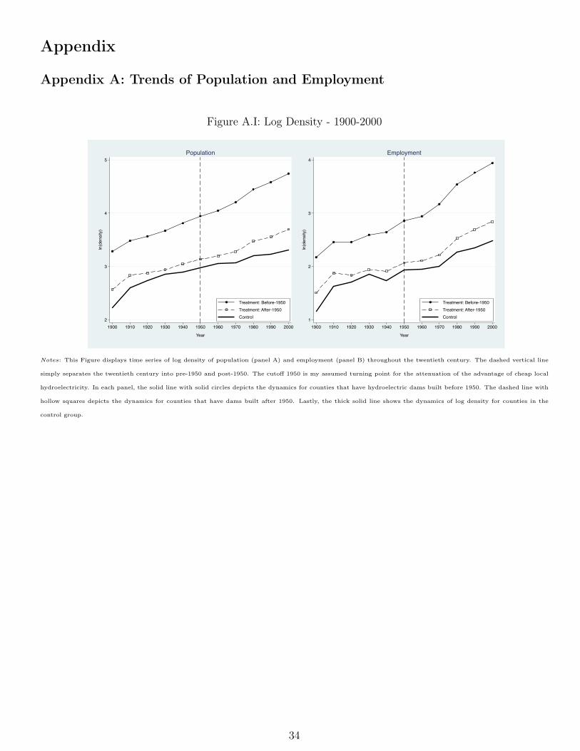
My impact estimates of hydro dams show that counties with dams built before 1950 have populationdensity increased by approximately 51 percent after 30 years, and 139 percent after 60 years, indicatingsubstantially different short- and long-term effects. Kline’s (2010) theoretical argument that assessingplace-based policies requires understanding the long-run effects of temporary interventions finds clearempirical support here. On the other hand, counties with dams built after 1950 have no statisticallysignificant effects. I argue that the large difference in the impact of pre- and post-1950 hydro dams canbe accounted for by the attenuation of the advantage of cheap local hydroelectricity in the second half ofthe twentieth century, as mentioned above.
Regarding agglomeration spillovers, the causal effects of hydro dams imply an average lower bound ofup to 45 percent five decades after dam construction (three decades after spillovers kick in). This long-runestimate represents almost half of the full impact of hydro dams over the same time span. Interestingly,my short-run estimate of agglomeration externalities is very close to that of Greenstone, Hornbeck andMoretti (2010). My lower bound nearly a decade after spillovers kick in is around 11.5 percent, while theirestimate five years after the opening of a Million Dollar Plant is 12 percent. Taken together, my short-and long-run estimates point to an amplification of spillovers over time. This suggests that spillovers may
4Other studies that examine long-term adjustments to temporary shocks are, for example, Blanchard and Katz (1992),Davis and Weinstein (2002, 2008), Redding and Sturm (2008), Miguel and Roland (2011), Hornbeck (2012), and Kline andMoretti (2014).
4
sustain high levels of local development in the long-run.I also find that the estimated short- and long-run effects are highly robust to alternative procedures
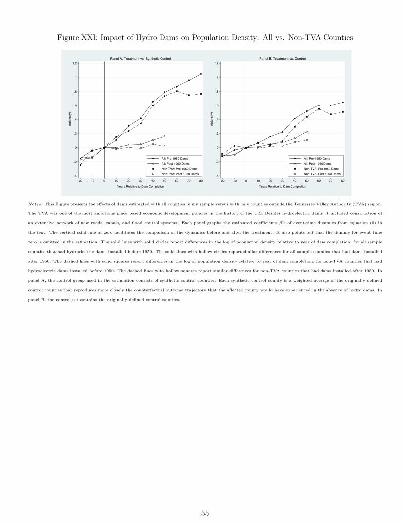
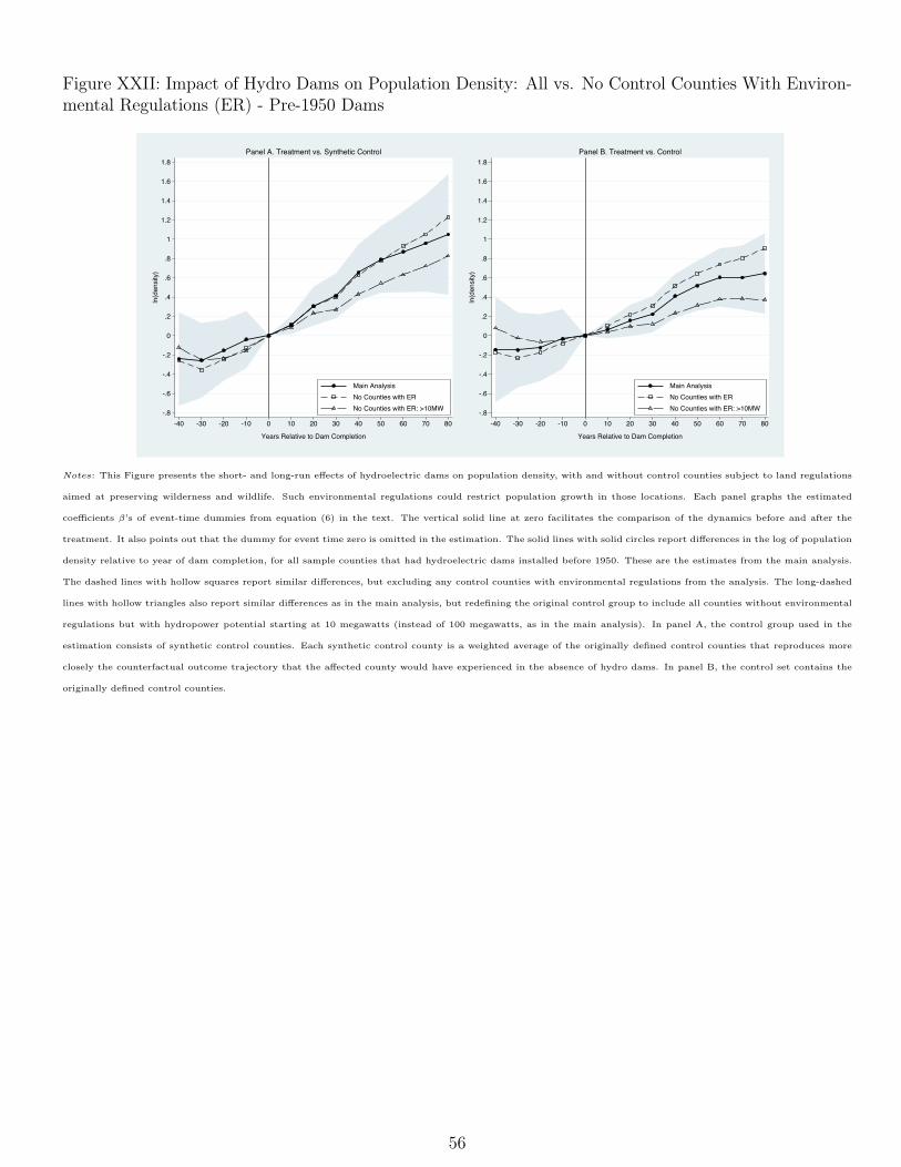
for selecting synthetic controls, to controls for confounding factors such as proximity to transportationnetworks, and to alternative sample restrictions, such as dropping dams built by the Tennessee ValleyAuthority (TVA) or removing control counties with environmental regulations. I also provide evidence ofsmall local agglomeration effects from smaller dam projects, and small spillovers to nearby locations fromlarge dams.
There is a growing empirical literature investigating path dependence. Much of it is concerned withpersistence of the spatial distribution of economic activity following the attenuation or elimination of alocational advantage. The seminal contribution is Bleakley and Lin (2012). They document the continuingimportance of historical portage sites after their original advantages had become obsolete. Only a smallnumber of recent papers emphasize the mechanisms driving those persistent effects. In what is probablythe most closely related paper to my own, Kline and Moretti (2014) provide evidence that the long-runeffects of one of the most ambitious regional development programs in U.S. history - the TVA -, areconsistent with the presence of agglomeration economies in manufacturing. A structural approach is thenused to suggest that those agglomeration gains in the TVA region are offset by losses in the rest of thecountry. My paper not only reinforces the role of agglomeration spillovers in understanding the long-termimpact of large infrastructure projects, but crucially shows that those spillovers are prominent even whennatural advantages are directly and flexibly taken into account in the analysis. This is an important pointbecause Rosenthal and Strange (2004) argue that most agglomeration effects found in the literature sufferfrom biases due to the inability to control for natural advantages.
Finally, this work also contributes to the literature dealing with the effects of dams and electrification.Duflo and Pande (2007)’s influential study of the impact of large irrigation dams on agricultural productionand poverty rates in India pioneers the use of geographical suitability to identify the effects of dams.Instead of just comparing outcomes of districts with and without irrigation dams, they use variation indam construction induced by differences in river gradient across districts within Indian states to obtaininstrumental variable estimates. Lipscomb, Mobarak and Barham (2013) follow suit by using hypotheticalelectricity grids associated with only geography-based cost considerations to estimate the developmenteffects of electrification across Brazil over the period 1960-2000. My approach looks more like a randomizedcontrol trial. My analysis is restricted to U.S. counties with similar hydropower potential, some of whichreceived hydro dams and some did not.
The remainder of the paper is organized as follows. Section 2 provides a historical discussion of theprocess of electrification in the U.S., focusing on the local importance of hydroelectricity in the first halfof the twentieth century. Section 3 presents a simple theoretical framework to identify agglomerationspillovers. Section 4 discusses the research design and related issues. Section 5 describes the databasesused in the study. Section 6 outlines the methodology for the empirical analysis. Section 7 reports anddiscusses results regarding the impact estimates of hydro dams, the estimate of agglomeration spillovers,and the persistence of dam effects. Finally, Section 8 provides some concluding remarks.
5
2 Historical Background
My strategy to identify agglomeration spillovers relies on the strength of the cheap local power (CLP)advantage arising from the construction of hydroelectric dams in the first half of the twentieth century,and the attenuation of that advantage in the second half of the century. In this section, I providesuggestive evidence on the CLP advantage using cross-county variation in prices of electricity purchasedby manufacturing, and discuss the historical context. Then, I present a case study illustrating key pointsof my identification strategy.
2.1 Cheap Local Power (CLP) Advantage
In the first half of the twentieth century, hydroelectric dams seem to provide cheap and abundant electricityonly for surrounding areas. In fact, power appears to be much cheaper in counties hosting pre-1950 damsthan in counties with hydropower potential but no hydroelectric facilities. By regressing the log of theunit value of electricity purchased by manufacturing in 1947 (Bureau of the Census, 1949) on a dummyfor pre-1950 treatment, controlling for state fixed effects, a cubic function on latitude and longitude, and50-year average rainfall and 50-year average temperature for each season of the year, I find a coefficient ofapproximately -0.60 (s.e. 0.22). This means that electricity price was roughly 45 percent lower in pre-1950treated counties relative to controls5. This is not the case, however, for counties that had hydropowerplants constructed only in the second half of the century. The estimated coefficient for the post-1950treatment in a regression similar to the one described above was not statistically significant (-0.28, withs.e. 0.34).
In the second half of the century, construction of high-tension transmission lines and technologicalimprovements in the competing thermal power generation may have attenuated differences in electricityprices across the country. To test this hypothesis, I redo my analysis above with electricity prices in 2000,constructed from data available from the Energy Information Administration (EIA) form 861, as in Kahnand Mansur (2012). Relative to the control group, neither pre-1950 nor post-1950 treated counties havelower prices that are statistically significant. For pre-1950, the coefficient of the dummy of treatment isapproximately -0.10 (s.e. 0.06), and for post-1950, it is nearly -0.07 (s.e. 0.05). Therefore, my assumptionof attenuation of the CLP advantage after 1950 seems reasonable.
Another piece of evidence supporting cheap electricity as the force driving my results later on comesfrom the dispersion of prices across counties. If electricity could be transmitted costlessly from suppliersto consumers, and electricity markets were nationally competitive, then we would observe no differencein prices over the country. Because there was no major change in regulation around the middle of thecentury, variations in dispersion in that period might be associated with transmission costs. The standarddeviation of the log of the unit value of electricity purchased by manufacturing decreased from nearly 0.46,
5It is important to point out that Kitchens (2012) finds that the price of electricity for residential consumers was notlower between 1929 and 1955 in the TVA area, where many pre-1950 hydro dams were built. However, he does provideevidence that TVA electric rates for large industrial consumers and commerical firms were lower than comparable electricservice. According to him, rates for large industrial firms were between 3 and 34 percent lower depending on the demandcapacity and usage level.
6
in 1947, to 0.38 (Davis et al., 2013), in 1972. Because most of the high-voltage transmission lines werebuilt in the 1950s and 1960s, this 17 percent drop in the standard deviation may reflect a higher degreeof spatial interconnection of the electrical grid.
In order to better understand the assumption of CLP advantage, let us go back to the historical contextaround the discovery and emergence of electricity. The invention of the continuous direct current (D.C.)dynamo in 1870 was a major breakthrough. Although lighting and traction (i.e., electric streetcars) wereamong the first benefits of the new technology, the most important consequence of the dynamo revolutionwas the process of industrial electrification following the invention of the polyphase alternating current(A.C.) motor in 1888 (see chronology in Table I). Between 1880 and 1930, the production and distributionof mechanical power rapidly evolved from water and steam-driven line shafts connected by belts to electricmotors that drove individual machines.
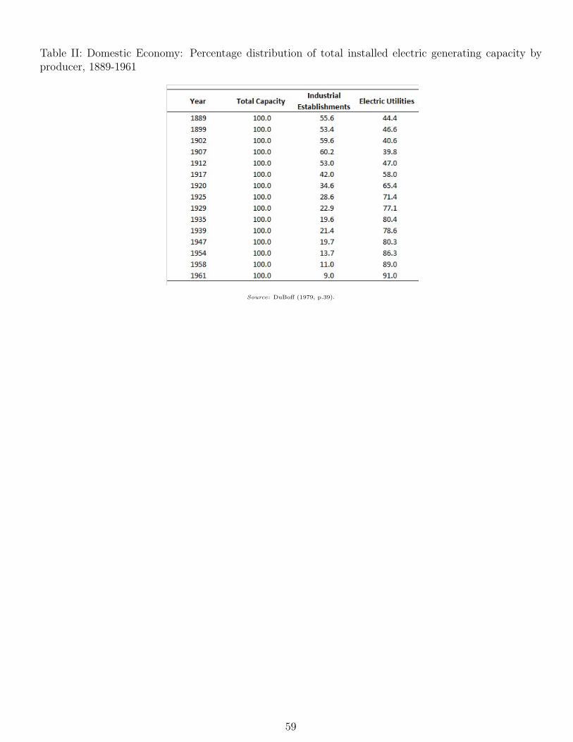
During this rapid transition in energy use, the U.S. power industry became highly specialized andelectric utilities gained prominence. In early 1900s, around 60 percent of the electricity used in manufac-turing was generated by the establishments themselves. By 1917, however, eletric utilities were alreadygenerating more power than industrial plants. By the late 1950s, their production had reached almost 90percent of total generation, as shown in Table II. This shift of electricity generation to the power sectorled manufacturing to become sensitive to local availability of power.
In the beginning, hydroelectricity prevailed as a source of motive power. This was probably dueto familiarity with water power and the high cost of coal to drive steam turbines. The availability of(cheap) hydroelectricity significantly affected the locational decisions of industrial plants. After the firsthydroelectric generating station was built near Niagara Falls in 1881, manufacturing flourished aroundhydro dam sites. Although "its supply is limited and plants have to locate where favourable sites exist"(Schramm, 1969, p.220), hydroelectricity continued having a large comparative advantage in the U.S. untilthe 1950s. The costless energy content of falling water, and the high mechanical efficiency of hydraulicturbines, were among the key factors maintaining that advantage.
Important innovations, however, took place in the field of thermal power generation. Technologicalimprovements increased boiler temperatures and operating pressures substantially, attaining greater ther-mal efficiencies. As depicted in Figure III, thermal efficiencies increased gradually until the early 1940s,and rapidly in the post-World War II years, reaching their current level around 1960. At the same time,electric utilities started constructing larger generating plants to capture economies of scale. As a result,steam power gave location flexibility to firms. Thermal power plants could be built almost anywhere,provided that fuels and a minimum amount of boiler and cooling water were available.
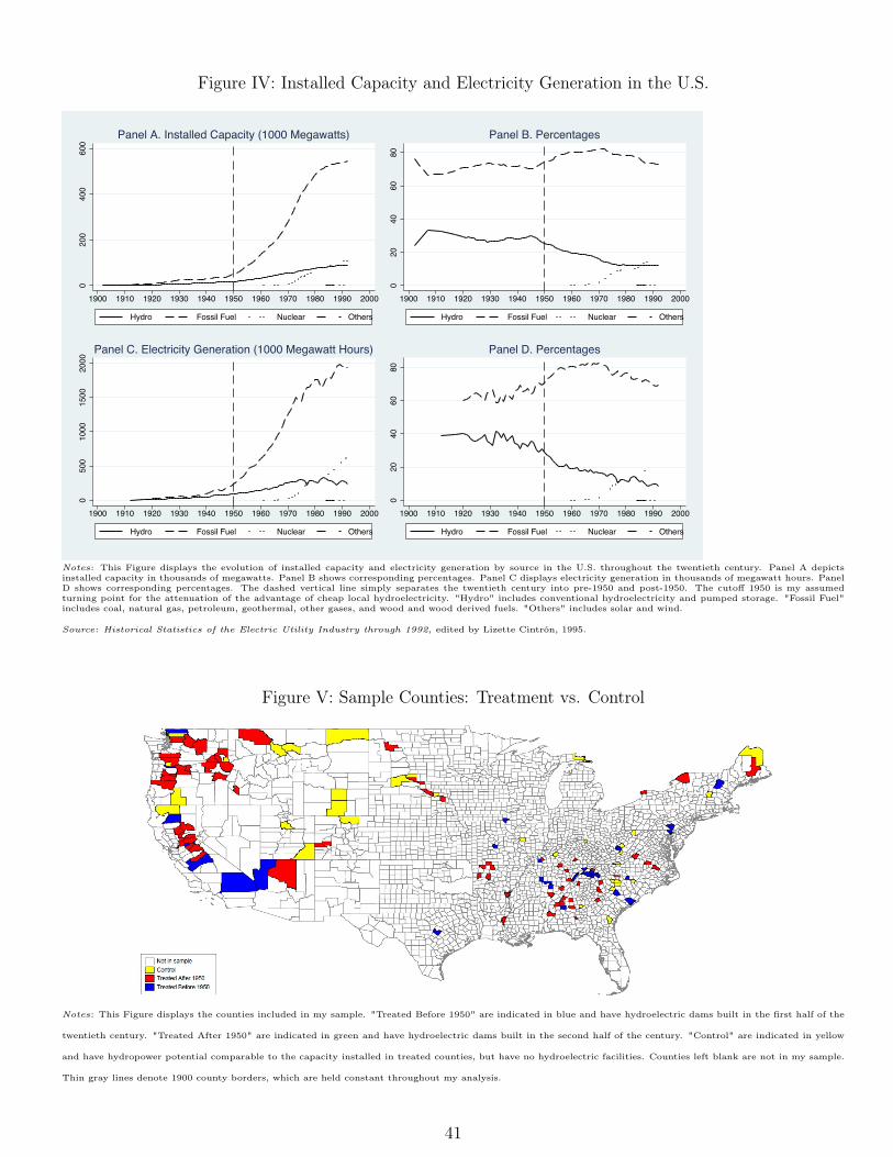
Summarizing the transformation of the electricity industry around the middle of the twentieth century,Schramm (1969) states that "the historical cost advantage of hydropower vis-à-vis other generating methodshas been (...) drastically reduced. (...) Fifteen to twenty years ago [1949-1954], power-intensive industriesfound it advantageous to move their plants to sites where cheap hydropower was still available. Today,with generating cost differentials reduced so drastically, these advantages have all but disappeared." (p.225-226). The tremendous post-1950 growth of steampower relative to hydropower, presented in Figure IV,corroborates his conclusions.
7
Yet another major change happened in the electricity sector in the 1950s: the emergence of highervoltage transmission lines. The nineteenth century inventors who first began to harness electricity touseful purposes did so by putting their small generators right next to the machines that used electricity.The development of the A.C. system allowed power lines to transmit electricity over much longer distances.In 1896, for instance, an eleven-kilovolt A.C. line was built to connect a hydroelectric generating stationat Niagara Falls to Buffalo, twenty miles away. From then on, the voltage of typical transmission linesgrew rapidly.
Nevertheless, until 1950, the number of circuit miles of high-voltage transmission lines - 230 kilovoltsand above - was extremely small in the U.S. That number more than tripled to over 60,000 circuit milesin the 1960s (Brown and Sedano, 2004). This was a huge expansion: approximately 40 percent of all high-voltage transmission lines installed in the U.S. at the end of the twentieth century had been constructed inthe 1950s and 1960s. Such developments gave utilities access to ever more distant power sources, furtherreducing the appeal of cheap local hydroelectricity.
2.2 Case Study - Bonnevile Dam
To illustrate the key ideas advanced in this study with historical anecdotal evidence, I discuss the caseof the Bonneville Dam, a hydropower plant built in the 1930s. In an effort to prevent extortion againstthe public by giant electric utilities, and to provide employment during the Great Depression, the U.S.government started large hydroelectric projects in the West. One of them was the Bonneville Dam, onthe Columbia River between the states of Washington and Oregon. Construction began in June 1934,and commercial operation was achieved in 1938.
In 1937, Congress created the Bonneville Power Administration (BPA) to deliver and sell the powerfrom Bonneville Dam (see important historical facts in Table I). The first line connected the dam toCascade Locks, a small town just three miles away. Major construction from the 1940s through the 1960screated networks and loops of high-voltage wire touching most parts of BPA’s current service territory,which includes Idaho, Oregon and Washington, and small portions of California, Montana, Nevada, Utahand Wyoming (BPA, n.d.). During that time, Congress authorized BPA to commercialize power fromother federal dams on the Columbia and its tributaries. By 1940, however, the federal pricing policy wasset: all federal power was marketed at the lowest possible price while still covering costs.
The initial wholesale cost of power from Bonneville Dam was $17.50/kW year (0.2 cents/kWh), a ratethat was maintained for 28 years. To take advantage of this cheap and abundant electricity, the AluminumCompany of America (ALCOA) and Reynolds Metals started to mobilize to build aluminum smelters inthe Northwest. ALCOA purchased property in Vancouver, Washington, in December 1939 and poured thefirst ingot on September 23, 1940 (Voller, 2010). Reynolds Metals purchased the property for a smelterin Longview, Washington, in 1940. By this time, with war raging in Europe, the U.S. government saw astrategic need to increase aluminum production for the impending defense effort and agreed to underwritethe construction of the Longview facility. The smelter opened in September 1941, just in time to meetthe aircraft industry’s increased need for aluminum (McClary, 2008).
Hydroelectric dams brought prosperity to their hosting locations, attracting hundreds of workers.
8
Vancouver, for instance, saw an industrial boom in the 1940s, including the Kaiser shipyard and the BoiseCascade paper mill, besides ALCOA (Jollata, 2004). Over the years, though, as many heavy industriesleft the U.S., Vancouver’s economy has largely changed to high tech and service industry jobs. Thecity contains the corporate headquarters for Nautilus, Inc. and The Holland (parent company of theBurgerville, U.S. restaurant chain). It seems that nowadays other forces attract people to Vancouver.They might be agglomeration spillovers.
3 Theoretical Framework
In this section, I enrich Greenstone, Hornbeck and Moretti’s (2010) framework with insights from Dufloand Pande (2007) to illustrate how the installation of hydroelectric dams could affect the attractivenessof hosting counties through advantage of local cheap electricity and agglomeration spillovers. I focus onthe profitability of firms in hosting counties, and I assume factor-neutral spillovers related to the impactof hydro dams.
Suppose that all firms have a production technology that uses labor, capital, land and electricity toproduce a nationally traded good whose price is fixed and normalized to one. Firms choose their amountof labor, L, capital, K, land, T , and electricity, E, to maximize profits:
maxL,K,T,Ef(A,L,K,E)� wL� rK � qT � sE,
where w, r, q and s are input prices, and A is a productivity shifter (TFP).More specifically, A includes all factors that affect the productivity of labor, capital, land and electricity
equally, such as technology and agglomeration spillovers of hydro dams, if they exist. To explicitly allowfor such agglomeration externalities, I let A depend on the population density in a county, N :
A = A(N).
Factor-neutral agglomeration spillovers exist if A increases in N : @A/@N > 0.Let L⇤(w, r, q, s) be the optimal level of labor inputs, given the prevailing wage, cost of capital, rent,
electricity rate, and population density. Similarly, let K⇤(w, r, q, s), T ⇤(w, r, q, s) and E⇤(w, r, q, s) be theoptimal level of capital, land and electricity, respectively. In equilibrium, L⇤, K⇤, T ⇤ and E⇤ are set sothat the marginal product of each of these four factors is equal to its price. I assume that capital isinternationally traded, so its price r does not depend on local demand or supply conditions. On the otherhand, I allow wage and rent to depend on local economic conditions: w(N) and q(N). In particular, Iallow the supply of labor and land to be less than infinitely elastic at the county level. Hence, w(N)
represents the inverse of the reduced-form labor supply function that links population density in a county,N , to the local wage level, w. Similarly, q(N) represents the inverse of the reduced-form land supplyfunction (Greenstone, Hornbeck and Moretti, 2010).
9
The equilibrium level of profits, ⇧⇤, can be written as
where now I make explicit the fact that TFP, wages and rents depend on the population density in acounty.
Consider the total derivative of profits with respect to a change in electricity price and in populationdensity:
d⇧⇤
ds=
@L⇤
@s
@f
@L� w
!
+@K⇤
@s
@f
@K� r
!
+@T ⇤
@s
@f
@T� q
!
+@E⇤
@s
@f
@E� s
!
� E⇤, (1)
d⇧⇤
dN=
@f
@A⇥ @A
@N
!
�
@w
@NL⇤!
�
@q
@NT⇤!
(2)
+@w
@N
(
@L⇤
@w
@f
@L� w
!
+@K⇤
@w
@f
@K� r
!
+@T⇤@w
@f
@T� q
!
+@E⇤
@w
@f
@E� s
!)
+@q
@N
(
@L⇤
@q
@f
@L� w
!
+@K⇤
@q
@f
@K� r
!
+@T⇤@q
@f
@T� q
!
+@E⇤
@q
@f
@E� s
!)
. (3)
If all firms are price takers and all factors are paid their marginal product, equations (1) and (2)simplify to
d⇧⇤
ds= �E⇤ < 0, (4)
d⇧⇤
dN=
@f
@A⇥ @A
@N
!
�(
@w
@NL⇤!
+
@q
@NT⇤!)
. (5)
Equation (4) is just the Hotelling’s lemma, implying that profits are higher when local electricityprices are lower. Equation (5) points out that the effect of an increase in N is the sum of two opposingforces. The first term,
⇣
@f@A ⇥ @A
@N
⌘
, represents the effect of positive agglomeration spillovers, if they exist.Agglomeration spillovers of hydro dams allow firms to produce more output using the same amountof inputs. On the other hand, the second term,
n⇣
@w@NL⇤
⌘
+⇣
@q@NT⇤
⌘o
, represents negative effects fromincreases in the cost of production, specifically, wages and rents. Intuitively, an increase in N is anincrease in the level of economic activity in the county and therefore an increase in the local demand forlabor (@w/@N > 0) and land (@q/@N > 0) . Unlike the beneficial effects of agglomeration spillovers,the increase in factor prices is costly for firms because they now have to compete more for locally scarceresources6.
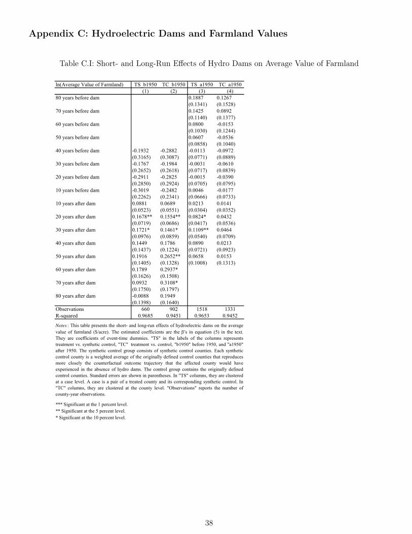
6As shown in Table C.I, in the Appendix, I find no strong evidence that dams affect land prices: @q/@N appears small.Kline and Moretti (2014) do not find effects of TVA on wages either. In that case, it may be reasonable to assume that@w/@N is also small or even zero.
10
Equations (4) and (5) provide useful guidance on what would happen after installation of hydroelectricdams. Assuming free entry, firms would move to counties hosting hydro dams to exploit rents arisingfrom cheaper electricity (d⇧⇤/ds < 0). Supposing imperfect substitution between labor and electricity,firms would hire lots of workers. This would potentially pull individuals from other locations, leadingto an increase in population density. In the presence of strong agglomeration spillovers, this increase inpopulation density would trigger a positive feedback mechanism that would continue attracting both firmsand workers to those places (d⇧⇤/dN > 0). Strong spillovers would keep attracting businesses even whencheap electricity had become available everywhere.
4 Location Decisions and Research Design
In testing for the presence of agglomeration spillovers, a key econometric challenge is that concentrationof economic activity also can be generated by natural advantages. Specific geographical features thatbring people and businesses to an area, such as detailed topography, resource endowments, and climate,are often unobserved, but they are problematically correlated to those location decisions.
Therefore, a naive comparison of population growth across counties with distinct natural endowmentsis likely to yield biased estimates of agglomeration spillovers. Some places might attract people becauseof such externalities, but some others might pull people in just because of an unobserved geographicalattribute. Credible estimates of spillovers require the identification of locations which are similar innatural advantages.
The first appealing characteristic of my research design is the narrowing of my sample to encompasscounties that are comparable in some natural features. Indeed, I compare only counties that have similarpotential to generate hydroelectricity, as determined by an engineering team in the beginning of the1990s, at the request of the U.S. Department of Energy. As is well-known in the engineering literature,suitability of sites for hydro dams depends on parameters associated with topography and inflow in thecatchment area, morphology of the river valley, geological and geotechnical conditions, and climate andflood regime. Therefore, I believe my approach controls for important geographical peculiarities of countiesin my sample.
Locations with similar geography tend to have similar economic activity. It would then be desirableto have temporary shocks that would make some of these areas more attractive than others. In thatcase, workers and firms would concentrate in certain areas even if they could enjoy the same geographicalfeatures in other places. After the interruption of the shocks, affected areas would have higher populationdensity. If they continued having higher population growth after the cessation of the shocks, this wouldbe an indication of the presence of agglomeration spillovers.
The second valuable feature of my research design is the use of the appeal of cheap local hydroelectricityin the first half of the twentieth century as such a shock. Not every county with suitable dam sites everhad hydropower plants constructed. Therefore, not every county with appropriate dam sites had access tothe cheapest source of electricity until 1950. By the middle of the century, however, such advantage wasreduced considerably, as argued in previous sections. As thermal power generation was enjoying major
11
technological improvements, and high-voltage transmission lines were being constructed, cheap electricitywas becoming available to most counties across the nation.
Obviously, the validity of my research design depends on the assumption that places with hydropotential where dams were not built provide a valid counterfactual for similar places where dams werebuilt. This in turn requires a clearer understanding of why dams were not built in some counties withhydroelectric potential. Prior to World War I, hydroelectric power development was mostly a privateventure. However, with private hydro plants increasingly interfering with navigation in the East andMidwest, government regulation evolved to become stricter. Congress initially attempted to regulate damconstruction through the Rivers and Harbors Acts of 1890 and 1899, requiring that dam sites and plansfor dams on navigable rivers be approved by the U.S. Army Corps of Engineers and the Secretary of War.Then, the Right-of-Way Act of 1901 gave the Secretary of the Interior the authority to grant rights-of-wayover public lands for dams, reservoirs, waterpower plants, and transmission lines (see Table I for keyhistorical facts related to hydroelectricity in the U.S.).
Although "between 1894 and 1906 Congress issued 30 permits for private dams, mostly along theMississippi River" (Billington, Jackson and Melosi, 2005, p.37), the federal government began to reservewaterpower sites for conservation and wise use, and to enter the business of hydroelectricity. Indeed, "inthe 1903 veto of private construction of a dam and power stations on the Tennessee River at Muscle Shoals,Alabama, Roosevelt protected the site for later government development, but he also helped to establish theprinciple of national ownership of resources previously considered only of local value." (Billington, Jacksonand Melosi, 2005, p.37).
The General Dam Act of 1906 was, perhaps, the legislation that most discouraged the entrance ofprivate enterprise into the hydroelectric sector. It "standardized regulations concerning private powerdevelopment, requiring dam owners to maintain and operate navigation facilities - without compensation- when necessary at hydroelectric power sites." (Billington, Jackson and Melosi, 2005, p.38). Privatecompanies fought for more favorable legislation, but ended up accepting the permit system. At the sametime, the federal government started to link hydropower to plans for waterway improvements. A 1910amendment to the 1906 act, for instance, underscored hydropower as a mechanism for navigation andflood control projects. The connection between hydropower and local development, and the participationof the federal government in the power sector, would only increase afterwards.
The organization of the electricity markets in the beginning of the century also attracted governmentalintervention. At first, private electric utility companies dominated the market. However, the proliferation,consolidation, and complexity of such companies coincided with a number of financial and securitiesabuses, sometimes inflating costs that were passed through to the retail customers. As a response,"Georgia, New York and Wisconsin established State public service commissions in 1907, followed quicklyby more than 20 other states. Basic state powers included the authority to franchise the utilities, to regulatetheir rates, financing, and service, and to establish utility accounting systems" (EIA, n.d.).
The foundations for strong federal involvement in the electricity industry were also established between1900 and 1930 (EIA, n.d.). First, the electric power industry became recognized as a natural monopoly ininterstate commerce subject to federal regulation (Supreme Court Ruling of 1927 - see chronology). Sec-
12
ond, the federal government owned most of the nation’s hydroelectric resources. Third, federal economicdevelopment programs accelerated, including electricity generation. After 1930, the federal governmentbecame both a regulator of private utilities and a major producer of electricity. Both regulation andproduction were aimed at generating less expensive electricity for customers.
Federal participation also increased because of national efforts to overcome the Great Depression in the1930s, and to meet the massive electricity requirements for wartime production in the 1940s. Considerablefunding was provided for the construction of large federal dams and hydroelectric facilities. This is theperiod known as the Big Dam Era (Billington, Jackson and Melosi, 2005). Bonneville Dam, completedin 1938, was a public works project to help relieve regional unemployment during the Great Depression.Grand Coulee Dam, opened in 1942, supplied the electricity needed to produce planes and other warmaterial in support of World War II efforts. Later on, to meet escalating electricity needs in responseto the dramatic expansion of consumer demand and industrial production throughout the decades of the1950s, 1960s, and 1970s, many new electric generating facilities, including hydroelectric developments,were constructed.
As we can see, the decision of where to construct hydroelectric dams basically changed from the privatesector to the federal government in the first quarter of the twentieth century. Regional developmentconcerns - and environmental issues in the second half of the century - frequently guided the allocationof dams throughout the nation. Therefore, most hydro projects can be characterized as shocks of federalinvestment to local economies, creating rents to be exploited by local consumers and firms. Moreover,counties with higher economic growth potential have not always attracted more investments than countieswith lower growth potential. Instead, Hansen et al. (2011) argue that politics might have shifted theeventual location of major water infrastructure projects away from what otherwise might have been theoptimal location. They provide evidence suggesting that membership in congressional committees forwater resources, agriculture, and appropriations, often times unrelated to population pressures, generallyhas a positive and significant impact on the number of dams and the proportion of dams constructed ina state.
As the discussion above attests, my research design may be valid under relatively mild assumptions.In my main estimation, I end up using the group of counties with hydropower potential that was notdeveloped as my potential control group. Nevertheless, I also control flexibly for climate variables andgeographic coordinates, allowing them to vary with time, and use synthetic control methods to matchtreated and control counties more closely (details are presented in section 6)7. In my robustness checks, Iinclude other sets of controls such as proximity to transportation networks, and consider alternative defi-nitions for my potential control group, such as counties with hydropower potential but no environmentalregulations.
7As discussed in the next sections, the synthetic control method allows me to match the trajectory of population oremployment density in treated and control counties before the construction of the dams. If by any chance private firmsinfluenced the selection of dam sites due to economic activity considerations, such as ALCOA suggesting the location ofthe Gran Coulee Dam to officials in Washington D.C., then that match takes such concerns into account in the empiricalanalysis. In that case, individual counties in the potential control group might not be suitable controls, but the constructed"synthetic control" counties, combinations of potential control counties which will be introduced later on, may be arguablyvalid controls for the treated ones.
13
A third and last feature of my research design is its ability to control for the effect of direct investmentin the estimation of agglomeration externalities. Counties that hosted hydroelectric dams in the first halfof the twentieth century might have had another important initial stimulus in their local economies, on topof the appeal of cheap local hydroelectricity. The construction of hydropower plants might have increasedthe local stock of capital substantially, and might have attracted workers and firms as well. Because notall counties with hydro dams had their facilities built at the same time, I use the counties with dams builtafter 1950 to refine my identification of spillovers. Since these counties experienced the same infusion ofcapital as the counties with pre-1950 dams, but did not enjoy the advantage of cheap local power, theycan be used to purge the estimates of agglomeration economies of this source of confoundedness.
5 Data Description
My basic dataset is a balanced panel of 154 U.S. counties covering the period from 1900 to 2000. Itincludes all counties with a hydropower potential of 100 megawatts or more. This choice of sampleensures that counties are similar with respect to natural endowments. County-level data on populationand employment are drawn from the U.S. census of population (Haines and ICPSR, 2010; MinnesotaPopulation Center - NHGIS, 2011). Variables of interest include population density and employmentdensity, which have usually been used as proxies for economic activity. Other data sources include climatedata from Schlenker and Roberts (2009), market access data from Donaldson and Hornbeck (2012), andhydropower data from INL (1998) and eGRID (2010), as presented below. To account for county borderchanges, data are adjusted in later periods to maintain the 1900 county definitions (Hornbeck, 2010).
A natural measure of hydropower potential is capacity installed in hydro plants plus undevelopedcapacity. A unique feature of my database is the inclusion of a measure for the undeveloped capacity. Itcomes from the 1998 U.S. Hydropower Resource Assessment, prepared by the Idaho National Engineeringand Environmental Laboratory (INL) for the U.S. Department of Energy (DOE) (Conner, Francfort,and Rinehart, 1998; INL, 1998). A measure of installed capacity comes from the U.S. EnvironmentalProtection Agency’s Emissions and Generation Resource Integrated Database (eGRID) for 2007 (eGRID,2010).
The INL report presents DOE’s efforts to produce a more definitive assessment of undeveloped hy-dropower resources within the U.S. No agency had previously estimated the undeveloped hydropowercapacity based on site characteristics, stream flow data, and available hydraulic heads. Initial efforts be-gan in 1989 and information from the last state was received in 1998. State agencies such as departmentsof dam safety, water resources, environmental quality, fish and game, history, and commerce, contributedinformation about hydropower resources within their states. The report summarizes and discusses theundeveloped conventional hydropower capacity for the 5,677 sites within the country. It does not includethe capacity produced by pumped storage sites. However, for conventional hydropower, the resourceassessment contains site identification information, geographic coordinates, and crucially the estimatednameplate capacity8.
8Nameplate capacity refers to the intended technical full-load sustained output of a facility.
14
The eGRID is a comprehensive inventory of the generation and environmental attributes of all powerplants in the U.S. Much of the information in this database, including plant opening years, comes fromDOE’s Annual Electric Generator Report compiled from responses to the EIA-860, a form completedannually by all electric-generating plants. In addition, eGRID includes plant identification information,geographic coordinates, number of generators, primary fuel, plant nameplate capacity, plant annual netgeneration, and whether the plant is a cogeneration facility.
My sample consists of counties that have either (i) non-cogeneration plants with installed capacity of100 megawatts or more, generating electricity only through conventional hydropower, or (ii) undevelopedsites with estimated nameplate capacity of 100 megawatts or more. Because often capacity builds up grad-ually, I assume that a county has hydroelectric dams only when it reaches the 100-megawatt nameplate.I use the same cut-off to determine the year in which a dam is completed. Counties with hydroelectricfacilities are my "treated" counties, and those with undeveloped sites are my "control" counties. Here,"undeveloped" means with no dams at all, or with dams for purposes other than power generation (e.g.,flood control, irrigation, and navigation).
Figure V displays the sample counties. As we can see clearly, most of them are located in two regionsof the country: South (44.8 percent) and West (38.3 percent). Because they have similar hydropowerpotential, they likely have comparable topography. However, because they are somewhat spread withinregions, climate variables (50-year average rainfall and 50-year average temperature for each season ofthe year) and geographic coordinates (latitude and longitude) are included in the empirical analysis tocontrol for other possible natural advantages.
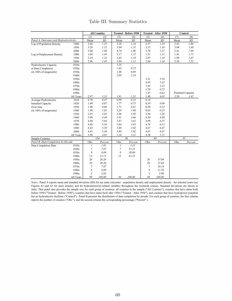
Table III reports county statistics for my main outcomes (population and employment density) andsome hydroelectric-related variables. Among the reported statistics, notice that pre-1950 treated countieshave the highest levels of outcomes throughout the twentieth century, followed by post-1950 treatedcounties, and then by control counties. (Figures A1 and A2, in the Appendix, display outcome trajectoriesfrom decade to decade.) Also, observe that most of the hydroelectric dams were constructed from the1920s to the 1980s, with a boom around the 1950s. In the beginning of the century, they were small, thenbecame larger to tap economies of scale in electricity generation, and finally came to be small again becauseof environmental concerns. Last, note the increase in hydroelectricity capacity after installation of thefirst plants. In some cases, hydropower facilities were upgraded; in others, new plants were constructed.Because these changes in installed capacity may affect outcomes directly, I control for them in my empiricalanalysis.
6 Empirical Framework
In this section, I present my novel empirical approach to obtain impact estimates of hydroelectric damsin the short and long run and my strategy to estimate agglomeration spillovers. My new approach is atwo-step procedure that combines synthetic control methods and event-study techniques. In the first step,I use synthetic control analysis to uncover the effect of dams for each treated county separately and, moreimportantly, to construct counterfactuals, which I refer to as "synthetic control counties". In the second
15
step, I pool all pairs of treated and synthetic control counties, and run an event-study analysis to findthe average treatment effect of dams across all treated counties. My strategy to estimate agglomerationspillovers follows the intuition provided by Figure I in the introduction.
6.1 Estimation by County - Synthetic Control Analysis
Initially, I estimate the impact of hydroelectric dams on population density for each treated countyseparately. I use synthetic control methods (Abadie and Gardeazabal, 2003; and Abadie, Diamond andHainmueller, 2010), which basically compare the evolution of population density for a treated countyto the evolution of the same outcome for a synthetic control county. The synthetic control county isa weighted average of potential control counties chosen to approximate the treated county in terms ofthe outcome predictors. The evolution of the outcome for the synthetic control county is an estimateof the counterfactual of what would have been observed for the affected county in the absence of daminstallation. Once treated and synthetic control counties have similar outcome behavior over extendedperiods of time before dam installation, a discrepancy in the outcome variable following installation isinterpreted as produced by the dam itself.
To provide a more formal summary of this approach, suppose that there is a sample of C +1 countiesindexed by c, among which unit c = 1 is the treated county and units c = 2 to c = C + 1 are potentialcontrols. Also, assume a balanced panel which includes a positive number of pre-intervention periods, T0,as well as a positive number of post-intervention periods, T1, with T0 + T1 = T .
Let Yct be the outcome of unit c at time t. For a post-intervention period t (with t � T0), the syntheticcontrol estimator of the effect of dam installation is given by the comparison between the outcome for thetreated county and the outcome for the synthetic control at that period:
Y1t �C+1X
c=2
w⇤cYct.
Let W = (w2, ..., wC+1)0 be a (C ⇥ 1) vector of positive weights that sum to one. Also, let X1 be a(k ⇥ 1) vector containing the values of the pre-intervention characteristics of the treated county, and letX0 be the (k⇥C) matrix collecting the values of the same variables for the counties in the "donor pool"9.Abadie and Gardeazabal (2003) and Abadie, Diamond and Hainmueller (2010) choose W ⇤ as the value ofW that minimizes
kX1 �X0WkV =q
(X1 �X0W )0V (X1 �X0W ),
where an optimal choice of V assigns weights to linear combinations of the variables in X0 and X1 tominimize the mean squared error (MSE) of the synthetic control estimator.
The matching variables in X0 and X1 are meant to be predictors of post-intervention outcomes, whichare not themselves affected by the intervention. Notwithstanding, using a linear factor model, Abadie,Diamond, and Hainmueller (2010) argue that if the number of pre-intervention periods in the data is large,the inclusion of pre-intervention outcomes in X0 and X1 helps control for unobserved factors affecting the
9"Donor pool" is defined as the set of potential control counties out of which the synthetic control unit is constructed.
16
outcome of interest as well as for heterogeneity of the effect of the observed and unobserved factors. Thisapproach ends up extending the traditional difference-in-differences framework, allowing the effects ofunobserved variables on the outcome to vary with time. In my analysis, I use the following matchingvariables in X0 and X1 : (i) pre-dam log of population density up to the year before installation, (ii)dummies for the four regions of the country (Northeast, Midwest, South, and West), (iii) cubic functionin latitude and longitude, and (iv) 50-year average rainfall and 50-year average temperature for eachseason of the year.
A byproduct of the synthetic control estimation is the construction of synthetic control counties.Using the weights that minimize the MSE of the synthetic control estimator, I generate a counterfactualfor each treated county in my sample. Each counterfactual, or synthetic control county, represents aweighted average of the counties contained in the donor pool. Hence, it has outcomes and characteristicsrepresenting weighted averages of outcomes and characteristics, respectively, of the originally definedcontrol counties. In the end, I obtain a pair of treated and synthetic control counties for each countyhosting hydroelectric dams.
6.2 Pooled Estimation - Event-Study Analysis
To provide an average estimate of the impact of hydroelectric dams on population density, with damsbuilt in different decades, I pool all pairs of treated and synthetic control counties, and use an event-study research design (e.g., Jacobson, LaLonde, and Sullivan, 1993; McCrary, 2007; and Kline, 2012). Anevent-study analysis can recover the dynamics of the impact of those dams in the short and long run, andtest whether hydro dams were constructed in response of county-specific trends in population density. Ifollow Kline’s (2012) exposition of such an approach here.
Consider the following econometric model of population density:
Yct =X
y
�yDyct + ↵c + �rt + Z
0
c�t +X0
ct�+ "ct, (6)
where Yct is the log of population density in county c in calendar year t, ↵c is a county effect, �rt is aregion-by-year fixed effect, Zc is a vector of time-invariant county characteristics (cubic function in latitudeand longitude, and 50-year average rainfall and 50-year average temperature for each season of the year)whose coefficients are allowed to vary in each year, Xct is a vector of time-varying county attributes (cubicfunction in dam size and in capacity of thermal power plants), and "ct is an error term that may exhibitarbitrary dependence within a county but is uncorrelated with the other right-hand side variables10.
The Dyct are a series of event-time dummies that equal one when dam installation is y years away in a
county. Formally, we may writeDy
ct ⌘ I[t� ec = y],
where I[.] is an indicator function for the expression in brackets being true, and ec is the year a dam isinstalled in county c.
10The reason for this exact specification will be clear in section 7, subsection "Specification Issues".
17
Thus, the �y coefficients represent the time path of population density relative to the date of daminstallation, conditional on observed and unobserved heterogeneity. If dams are randomly assigned tocounties, the restriction �y = 0 should hold for all y < 0. That is, dam installation should not, onaverage, be preceded by trends in county-specific population density. Because not all of the �’s can beidentified due to the collinearity of D’s and county effects, I normalize �0 = 0, so that all post-installationcoefficients can be thought of as treatment effects. Lastly, I impose the following endpoint restrictions:
�y =
8
<
:
�, if y � 80
�, if y �80,
which simply state that any dynamics wears off after eighty years. This restriction helps to reducesome of the collinearity between the region-by-year and event-time dummies. As explained in Kline(2012), because the sample is unbalanced in event time, these endpoint coefficients give unequal weightto counties installing hydro dams early or late in the sample. For this reason, I focus the analysis on theevent-time coefficients falling within an eighty-year window that are identified off of a nearly balancedpanel of counties.
Reweighting/Matching Empirical Strategy
My two-step procedure to obtain impact estimates of hydroelectric dams can be seen as a reweight-ing/matching strategy to estimate treatment effects that accounts for time-varying unobserved hetero-geneity. First, I find a synthetic control unit for each treated county using synthetic control methods. Asdiscussed above, a synthetic control is a weighted average of potential control counties that replicates thecounterfactual outcome that the treated county would have experienced in the absence of the treatment(dam installation). Recalling that time-varying unobserved heterogeneity is taken into account in theestimation of the synthetic-control optimal weights (Abadie, Diamond and Hainmueller, 2010), syntheticcontrol counties represent reweighted aggregations of the originally defined control counties that accountfor time-varying unobserved heterogeneity.
Second, I match each treated county with its corresponding synthetic control to generate the samplewith which I run the event-study analysis. Because synthetic controls are objects intrinsically associatedwith their treated counterparts, I conduct hypothesis testing using standard errors clustered at the caselevel, where a case is a pair of a treated and its corresponding synthetic control county11.
6.3 Agglomeration spillovers
Having described my methodology to estimate the effects of hydroelectric dams on population density overa long period of time, I present my strategy to uncover lower bound estimates of agglomeration spillovers.As exemplified in the introduction, my measure of spillovers is the growth in population density in pre-1950treated counties over and above (i) the growth experienced by them until 1950, which is mostly due to the
11In Appendix B, I discuss an alternative approach to this reweighting-matching strategy. I consider the "syntheticpropensity score reweighting".
18
advantage of cheap local hydroelectricity, and (ii) the growth experienced by post-1950 treated counties,which probably results from changes in stock of capital, given the attenuation of the appeal of cheap localhydropower in the second half of the twentieth century. Hence, this measure reflects the dynamics ofpopulation growth that might arise when the effects of cheap electricity and direct investment fade away.It represents a lower bound for the agglomeration spillovers of pre-1950 dams because the subtraction ofthe impact of post-1950 dams eliminates not only the effects of changes in stock of capital, but also anypotential agglomeration effects of those dams.
Although my measure of agglomeration economies is easily illustrated in Figure I, it can be less clearwhen I average it across pre-1950 treated counties because of different dam completion dates. For anynumber of years y after dam installation, I can express it as
where b�CTB1950y is the coefficient of an event-time dummy for Counties Treated Before 1950 (CTB1950),
bG is the estimate of the average growth of population density from the time of dam installation until 1950for CTB1950, and b�CTA1950
y is the coefficient of an event-time dummy for Counties Treated After 1950(CTA1950).
To accommodate treated counties with hydroelectric plants built in different decades, bG is a weightedaverage of the impact of dams up to forty years after installation of the facilities, depending on thecounty-specific completion date. That is,
where d19_0s is the number of counties with dams built in a specific decade.
7 Results
In this section, I present two sets of results. First, I discuss the effects of hydro dams case by casefor a representative group of treated counties. These are my county-specific estimates, found throughsynthetic control methods. Then, I discuss the average impact of hydroelectric facilities for all treatedcounties in my sample. These are my pooled estimates, arising from event-study analyses. The evidenceof agglomeration spillovers is examined within this last subsection.
7.1 Synthetic Control Approach: County-Specific Estimates
Pre-1950 Dams
Emblematic Case. In Figure I, I have introduced the synthetic control estimator for Blount County,Tennessee, where Calderwood Dam was installed in the 1930s. In that Figure, population density growsrapidly from dam completion until 1950, and then slows down afterwards. Had the dam not been con-structed, there would have been just slight growth after 1930s, probably due to the Great Depression.
19
Therefore, the impact of the hydropower plant until 1950 was approximately 0.40 log points (49 percent).From 1950 to 2000, the effect was roughly 0.50 log points (65 percent). This second number is also anapproximate measure of agglomeration spillovers for Blount County, since the advantage of cheap localhydroelectricity weakened around 1950.
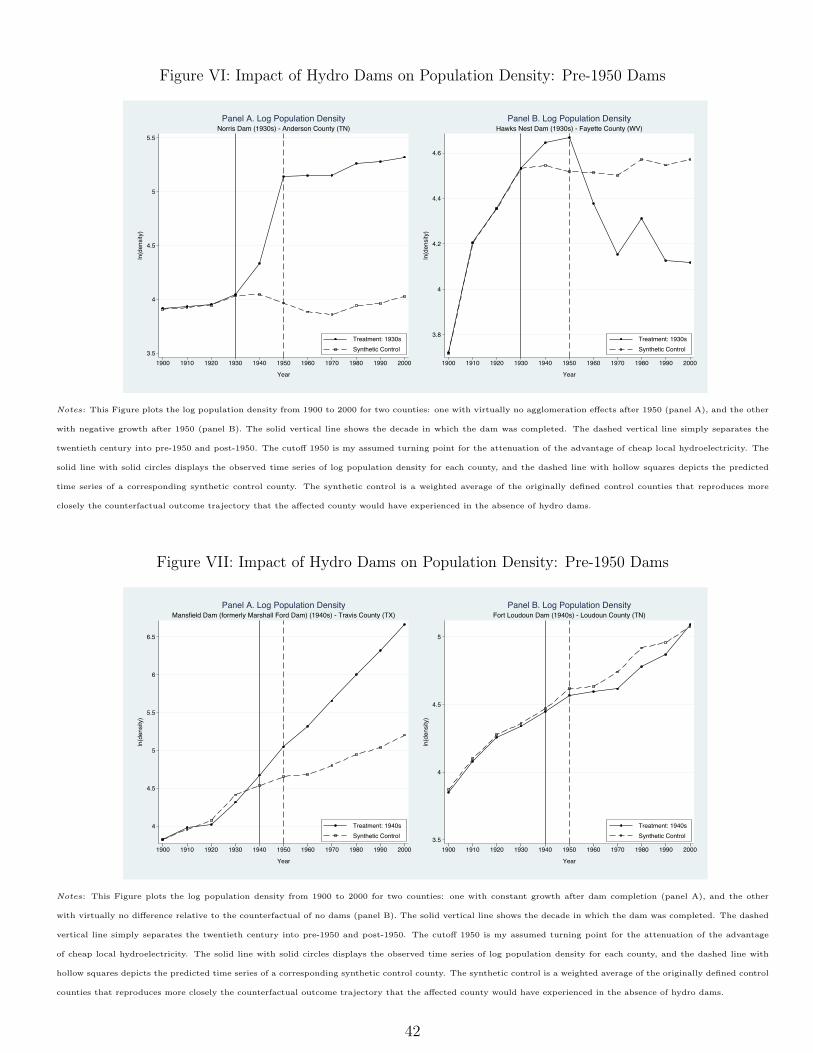
No Agglomeration Economies. Figure VI, panel A, displays a case of strong short-run effectof hydroelectric facilities, but almost no agglomeration economies. From completion in the 1930s until1950, Norris Dam induced growth of approximately 1.17 log points (223 percent) in population densityof Anderson County, Tennessee, relative to the counterfactual. Despite this enormous short-run impact,Anderson County grew only 0.12 log points (13 percent) afterward. Thus, the dam generated virtuallyno agglomeration externalities once cheap electricity spread around the country.
Reversion. A disturbing result of a public investment is illustrated by Hawks Nest Dam, installed inthe 1930s in Fayette County, West Virginia. Following dam completion, the county experienced a growthof almost 0.15 log points (16 percent) in population density relative to its counterfactual, as shown inFigure VI, panel B. Nevertheless, in the second half of the twentieth century, when the appeal of cheaplocal hydroelectricity became attenuated, that trend reversed and the county had a drop of 0.45 logpoints (36 percent) in population density. This is an emblematic case of lack of path dependence. Oncethe advantage of cheap local power reduces, and capital depreciates, people fly away.
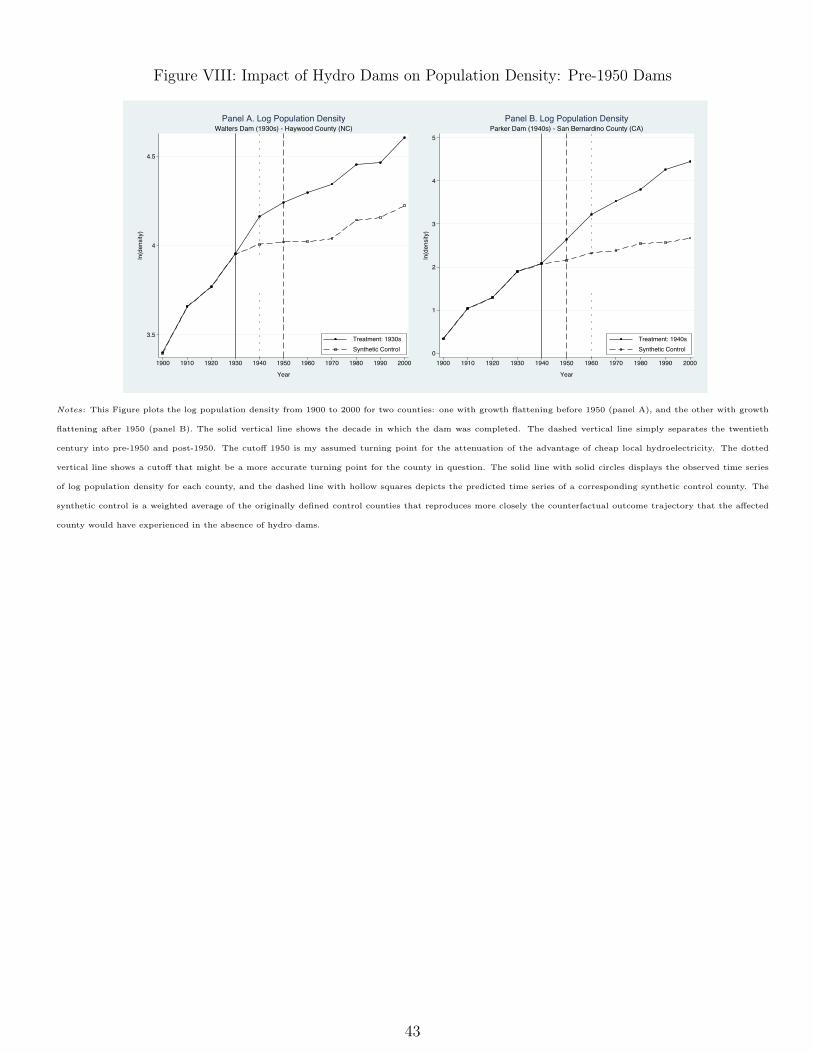
Constant Growth. An interesting outcome is the one exemplified by Travis County, Texas, whichhad Mansfield Dam (formerly Marshall Ford Dam) constructed in the 1940s. As displayed in Figure VII,panel A, once the dam was built, the county embarked on a stable path of population density growth, witha rate that remained constant until the end of the twentieth century. In the first decade, Travis Countyexpanded nearly 0.39 log points (48 percent) relative to its counterfactual. From 1950 to 2000, that trenddid not become flatter, and the county grew approximately 1.07 log points (191 percent). From a localperspective, this is what every policymaker would like to witness. After the initial push, agglomerationspillovers kicked in vigorously, producing a sustainable dynamic of growth.
Indifference. An unattractive situation from a policymaking point of view is the one portrayed byFort Loudoun Dam, built in the 1940s in Loudoun County, Tennessee. The trajectories of populationdensity of treated and synthetic control counties, shown in Figure VII, panel B, do not differ significantlyafter the installation of the plant. Apparently, the county would have grown steadily even without thehydropower facilities.
Timing of Attenuation of Cheap Local Power Advantage
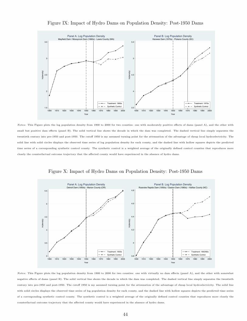
In the emblematic example of Figure I, the path of population density flattens out in 1950. As discussedin the historical section, this might be a good estimate of the period in which the appeal of cheaplocal hydroelectricity started to fade away. However, most of the high-voltage transmission lines wereconstructed in the 1950s and 1960s, and thermal efficiency increased gradually from the 1940s to the1960s, as displayed in Figure III. So it is possible that some counties experienced the compression ingrowth rates earlier or later than 1950. Indeed, Figure VIII presents two emblematic cases of suchpossibilities. Haywood County, North Carolina, for instance, witnesses the flattening in 1940, just a
20
decade after Walters Dams was completed. San Bernardino County, California, on the other hand, seesits growth rates in population density reduce only in 1960, two decades after Parker Dam had beencompleted. Therefore, the use of 1950 as the turning point of the attenuation of the advantage of cheaplocal hydroelectricity must be seen as an approximation only.
Post-1950 Dams
Figures IX and X display the dynamics of population density for four counties where hydroelectric plantswere installed in the second half of the twentieth century. These cases illustrate the typical effects thatI find in my analysis with post-1950 dams: moderately positive, small but positive, nonexistent, andsomewhat negative.
First, consider the case of Lewis County, Washington, which had both Mayfield Dam and MosyrockDam constructed in the 1960s (Figure IX, Panel A). Notice that the initial jump in population density,representative of the impact of pre-1950 dams, was relatively small here: around 0.16 log points (17percent) relative to the counterfactual, after a decade. This small effect seems to reinforce hydroelectricityas an advantageous local attribute in the first half of the century. Moreover, it indicates that directinvestment might also play a role in generating growth following dam completion. The impact grewgradually to nearly 0.35 log points (42 percent) in 2000. It is quite possible that some agglomerationspillovers are present here, over and above the effect of changes in stock of capital, but I cannot separatethem out.
In the second case (Figure IX, Panel B), the initial impact is even smaller, and potential agglomerationexternalities look negligible. Indeed, after installation of Keowee Dam in the 1970s, Pickens County, SouthCarolina, grew only approximately 0.09 log points (10 percent) in the first decade. Subsequently, thegrowth was minimal. In 2000, three decades after dam completion, the impact was just under 0.17 logpoints (18 percent). Therefore, agglomeration economies seem insignificant.
The third case, of Detroit Dam (Figure X, Panel A), concluded in the 1950s in Marion County,Oregon, shows no effect at all. It appears that the county would have grown as much as it did withoutthe hydro plant. Lastly, the fourth case (Figure X, Panel B) depicts a decrease in population density.After completion of Roanoke Rapids Dam, in the 1950s, and Gaston Dam, in the 1960s, people started toleave Halifax County, North Carolina. Part of such population decline might be due to displacement, butit seems odd that the county had not recovered even its pre-dam level of population density as of 2000.
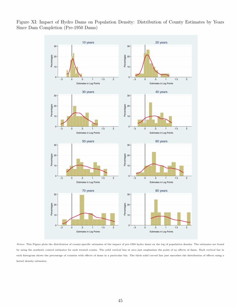
Distribution and Heterogeneity of County-Specific Dam Impacts
The cases mentioned above illustrate reasonably well typical dynamics of population density growth inmy sample. To provide a summary of all counties, I plot the distribution of pre-1950 dam effects inFigure XI, and of post-1950 dams in Figure XII. When we examine each column of Figure XI, we cansee clearly that the distribution of impacts of hydroelectric plants is shifting to the right. This movementhappens despite the attenuation of the appeal of cheap local hydroelectricity and the fading of the directinvestment effect. It is then quite plausible that agglomeration spillovers kick in at some point, and giverise to such a path dependence.
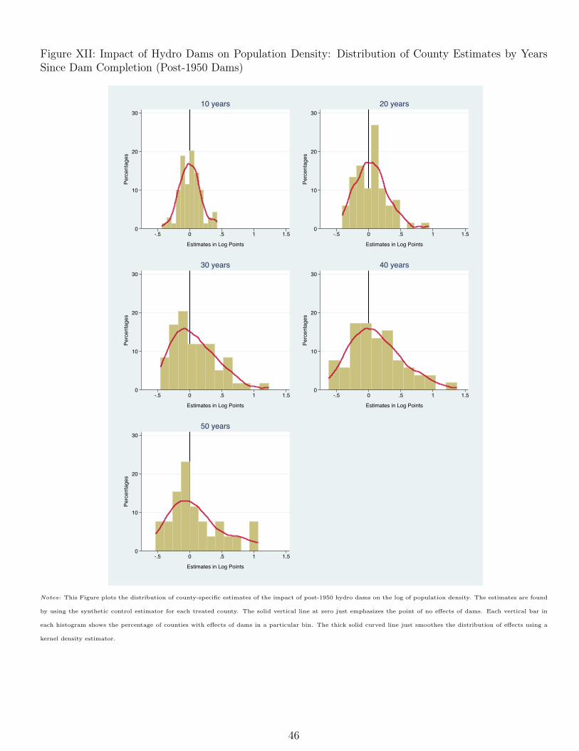
21
Figure XII, on the other hand, portrays a rather different story. Each column shows a distributionof dam effects somewhat inert around zero even after fifty years. This observation reinforces the ideaof cheap local hydroelectricity as a driving force of concentration of economic activity and subsequentagglomeration externalities.
Besides allowing me to plot the distribution of effects, county-specific estimates give me the possibilityof analyzing the heterogeneity of dam impact in a very simple and direct way. All that is necessary isto run panel data regressions of dam effects on characteristics of dams or locations hosting them, forexample, controlling for years relative to dam completion. Doing so, I find that pre-1950 dam effects are,on average, nearly 6 percent stronger (coefficient: 0.0575; s.e.: 0.0210) when dam size at completion isa hundred megawatts larger. In my sample, dam size at completion ranges from one to approximatelynine hundred megawatts for pre-1950 dams. On the other hand, I do not find any statistically significantheterogeneity regarding population density a decade before dam completion (coefficient: -0.0499; s.e.:0.0385).
7.2 Event-Study Analysis: Pooled Estimates
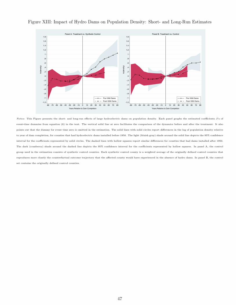
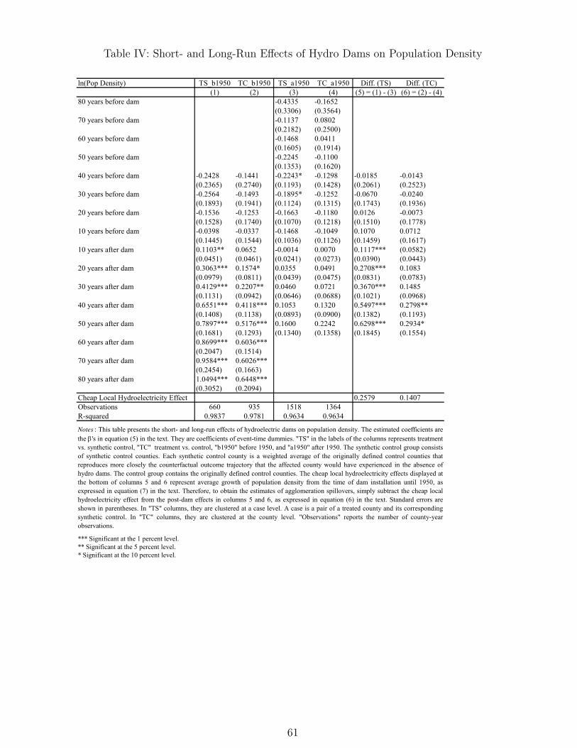
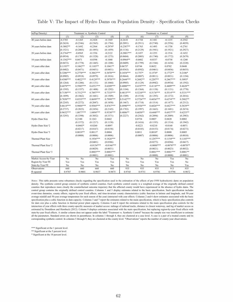
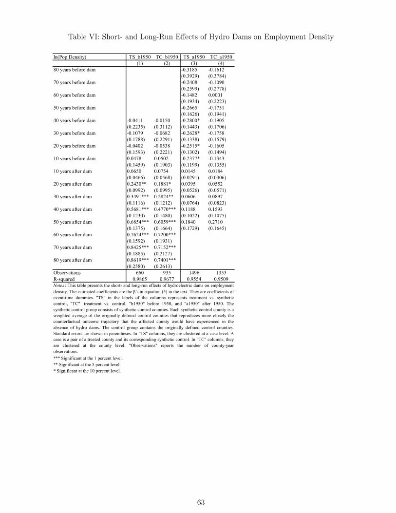
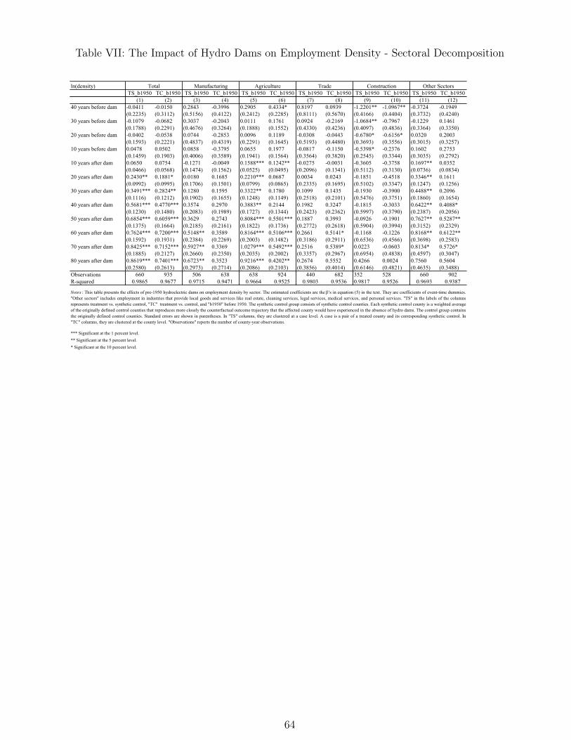
Short- and Long-Run Impact of Hydro Dams
When I pool all pairs of treated and synthetic control counties and estimate equation (6), I find quiteinteresting results12. First, the timing of dam installation appears to be crucial to the pattern of observedeffects. Hosting hydropower facilities in the first half versus the second half of the twentieth centurymeans enjoying a period of great prosperity versus no detectable changes, as depicted in Figure XIIIand Table IV. Indeed, counties with pre-1950 dams experience average increases in population densityof approximately 0.41 log points (51 percent) after 30 years13, and 0.87 log points (139 percent) after 60years, as shown in Table IV. On the other hand, counties with post-1950 dams experience no statisticallysignificant effects14.
12I discuss my results using the group of synthetic control counties. As explained in the methodology section, because bothobserved and unobserved heterogeneity are taken into account in the estimation of synthetic controls, and are allowed tovary flexibly over time, the comparison between treated counties and these controls might provide a more accurate estimateof the treatment effect. Nevertheless, for comparison purpose, I present results using the originally defined control countiesas well. Both sets of estimates are shown side-by-side in Tables and Figures. Notice that the estimates using the originalcontrol counties are smaller than those using synthetic controls. This might indicate that hydroelectric dams are allocatedto counties partially in response to negative population shocks. A similar issue associated with targetting poor places forinfrastructure projects is discussed in Duranton and Turner (2012) for the case of roads.
13Duflo and Pande’s (2007) pioneer study of the impact of large irrigation dams on agricultural production and povertyrates in India provides estimates over a time span of only three decades. Notwithstanding, their work produces credibleestimates of the impact of irrigation dams. Instead of just comparing outcomes of districts with and without irrigationdams, they use variation in dam construction induced by differences in river gradient across districts within Indian statesto obtain instrumental variable estimates.
14One may argue that focusing the analysis on counties hosting hydropower facilities instead of places accessing the powergrid might underestimate the impact of hydro dams. Through the grid, electricity might have been available in countiesoriginally defined as controls. Although this is a possibility, and an example would be Hoover Dam supplying power morethan 200 miles away to Los Angeles starting in 1936, a visual comparison between the map of transmission lines in 1923 and1962 (available upon request) show that the transmission network was very local in the first half of the twentieth century.Furthermore, the estimated effects of hydro dams in neighboring counties, presented below, suggest a much smaller rolethere.
22
Second, the enormous magnitude of the impact of hydroelectric plants seems somewhat remarkable.On average, county sizes more than double five decades after dam completion. Actually, populationdensity grows nearly 0.79 log points (120 percent) after 50 years of pre-1950 dam installation. Third,the difference in short- and long-term effects is revealing. The 30-year estimate presented above is lessthan half its 60-year counterpart. This suggests that the assessment of large infrastructure projects doesrequire understanding of long-run effects, as advocated by Kline (2010). The comprehensive report ofthe World Comission on Dams, in 2000, does provide some evidence of long-term effects of a few damsaround the world, but my study seems to provide the first systematic evaluation of impact of dams in thelong run. Fourth, and last, the strength of economic growth in the long run looks rather surprising. Theannualized growth rate of population density is roughly 1.6 percent in the first 40 years, and still 1 percentin the following 40 years. This might indicate the presence of either slow adjustment of capital stock toshocks or strong agglomeration economies. Below, I provide evidence that agglomeration spillovers mayexplain a great part of the late growth in population density.
Specification Issues
The first specification that I estimate in this study is equation (6), but without Xct. Such specification,which I refer to as the "basic specification", includes event-time dummies, county effects, region-by-yearfixed effects, and time-invariant county characteristics (cubic function in latitude and longitude, and 50-year average rainfall and 50-year average temperature for each season of the year) interacted with yeareffects. Because this set of covariates does not seem enough to eliminate all pre-treatment trends, asevident in Table V and in Figure XIV, I add controls for dam size to the basic specification. As explainedin section 5, dams above the 100-megawatt cutoff still differ in size, and might expand over time. WhenI include a cubic function in dam capacity, the post-treatment estimates remain unchanged, and thecoefficients of such controls are statistically insignificant. What seems to drive the effects of hydro damsis timing, not size. However, the inclusion of controls for dam size does remove any pre-treatment trends.
Next, I add controls for the size of thermal power plants present in my sample counties. My concern isthat counties with lower hydropower potential might respond to this natural constraint by building fossilfuel and/or nuclear power plants. In that case, the impact of hydro dams would be underestimated. Myestimates do increase when I include such controls, but just a little bit.
Also, I add controls for the interaction of year effects with three county-specific measures of marketaccess in 1890: mileage of railroad tracks, distance to closest waterway, and log of market access asestimated by Donaldson and Hornbeck (2012). One could argue that my control group, while appealingin some respects, does not necessarily have the same natural advantages simply because they have thesame hydropower potential. A concern will be that if a county has good hydro potential and is neara river or a rail line, the value of installing hydroelectric facilities there would be higher because thenlocal manufacturers could easily ship out their products. That could lead to bribes and political dealsthat would get the dams built in those places, and not in isolated places where, even if a dam wasbuilt, it would be hard to get manufacturers to move in. In such case, the impact of hydro dams would beoverestimated. After controlling for pre-dam proxies of market access, my post-dam estimates do decrease,
23
but not significatively. However, pre-treatment trends seem to be slightly more pronounced than in theprevious specification.
Lastly, I check how state-by-year fixed effects versus region-by-year fixed effects would change myfindings. One can argue that most energy policies are made at the state level, so the impact of hydrodams may reflect only state-specific effects. As evident in the chart with original control counties, this isnot the case here. (I could not run this specification with the synthetic control group because there werefewer observations than parameters to be estimated.) In the end, the specification that I use to reportmy findings throughout the paper - my main specification: equation (6) in the text - is the one withregion-by-year fixed effects, controls for dam size, and controls for capacity of thermal power plants.
Placebo Tests
In order to check whether my research design is capturing the impact of hydroelectric dams rather thanthe effect of some unobserved intervention, I run placebo tests. The estimated impact of dams would beundermined if I obtained effects of similar or even greater magnitudes in cases where/when the interventiondid not take place (Heckman and Hotz, 1989; Abadie and Gardeazabal, 2003; Bertrand, Duflo, andMullainathan, 2004; and Abadie, Diamond and Hainmueller, 2010). Therefore, I pool all counties andselect randomly treated before 1950, treated after 1950, and controls, and redo my analysis fifty times.For artificially treated counties, I also set the year of dam completion at random.
The estimated effects of artificial treatments are shown in Figures XV and XVI. For comparisonpurposes, I plot the impact of the real treatment as well. As we can see clearly, the effect of pre-1950hydro plants in counties that actually hosted them are distinguished from the placebo effects. This effect ishigher than any other effect in Figure XV. On the other hand, the impact of post-1950 dams is completelymixed with placebo impacts. These pieces of evidence reinforce the importance of pre-1950 hydroelectricdams in driving my results.
Agglomeration Spillovers
The effects of hydroelectric dams long after dam completion suggest that economic growth may be ampli-fied by additional forces such as agglomeration spillovers. The installation of large hydropower facilitiescombined with the local appeal of hydroelectricity in the first half of the twentieth century might haveinduced a process of cumulative causation in counties hosting pre-1950 dams. The initial investmentsand the resulting cheap electricity might have set in motion a chain reaction with multiple changes inpopulation density.
As illustrated by Figure I, and described in the methodology, in order to provide evidence of ag-glomeration economies I make two simplifying assumptions. First, I attribute any growth in populationdensity until 1950 to the advantage of cheap local hydroelectricity. Second, I suppose that the effects ofpost-1950 dams are driven mostly by changes in the stock of capital associated with dam installation,and, potentially, small agglomeration externalities. Hence, a lower bound of agglomeration economies canbe found by subtracting any impact of post-1950 dams from the post-1950 population density growth ofcounties hosting pre-1950 dams.
24
Figure XVII displays the impact of pre- and post-1950 dams in the top charts, and the differenceof those effects in the bottom charts15. The dotted line in the bottom charts represents the growthof population density from the completion of pre-1950 dams until 1950. Therefore, the lower bound ofagglomeration spillovers (or the magnitude of "pure" agglomeration externalities) is up to 45 percent (0.37log points) five decades after dam installation. The advantage of cheap local hydroelectricity might explainmost of the concentration of economic activity in the first 20 years after dam completion. Subsequently,spillovers seem to kick in, and may account for roughly 47 percent of the 50-year impact of hydroelectricdams.
My lower bound for agglomeration economies seems to be very large compared to other estimatesin the literature. For instance, Greenstone, Hornbeck and Moretti (2010) find that, five years after theopening of a Million Dollar Plant, incumbent plants’ TFP is 12 percent higher in hosting counties. Thus,my estimate appears to be almost four times larger than theirs. Most of the difference, however, is dueto the time horizons of our analyses. Theirs is a short-run estimate, mine is a long-run one. When Iconsider the lower bound nearly a decade after spillovers kick in, my estimate is around 11.5 percent (0.11log points), which is close enough to theirs. (My estimate then becomes 34 percent (0.29 log points) aftertwo decades of prominence of spillovers, and 45 percent (0.37 log points) after three decades.)
Sectoral Decomposition
Although I have described my results in terms of population density, I find similar patterns for employmentdensity. As depicted in Figure XVIII, and reported in Tables IV and VI, the effects of hydroelectric damson population and employment are closely related, but there is a lot of heterogeneity in the impact ondifferent sectors of the economy. In fact, the sectoral decomposition in Table VII and Figure XVIII showsconstruction and trade (trade defined as wholesale plus retail) with the weakest effects, manufacturingand agriculture with intermediate effects, and other sectors with the strongest effects. "Other sectors"consists basically of the nontradable sector of local economies. It includes employment in industries thatprovide local goods and services such as real estate, cleaning services, legal services, medical services, andpersonal services.
The patterns of sectoral employment after dam installation seem to make sense. In many hydroprojects, dams serve multiple purposes such as navigation, flood control, irrigation and hydropower. So,it is expected that agriculture benefits from them, especially in the West, where agricultural productiondepends heavily on irrigation. In fact, the development of hydro projects may lead to the adoptionof central pivot irrigation, which should increase productivity/crop yields and, as a consequence, landvalues16. It is also not surprising that employment in construction goes up when dams are being built,and down afterwards. This suggests that the agglomeration spillovers presented above do not seem toarise from construction sites. The dynamics of employment in trade is the only puzzling result. In general,it follows the pattern of other industries in the nontradable sector.
The strong long-run impact on the nontradable sector might reflect a local multiplier induced by15Differences are shown in columns 5 and 6 of Table IV.16Table C.I presents suggestive evidence of farmland value appreciation after the construction of hydroelectric dams.
25
agriculture and manufacturing growth, which in turn might have been driven by cheap hydroelectricity.Moretti (2010) finds that, for each additional job in the tradable sector in a given city, 1.6 jobs are createdin the nontradable sector in the same city. My results indicate a local multiplier of 1.5 five decadesafter dam completion, very close to Moretti’s estimate. Therefore, it is likely that the main mechanismgenerating agglomeration spillovers is the concentration of agricultural activity and manufacturing nextto hydropower plants. The importance of agriculture in this setting is somewhat remarkable. Indeed,Hornbeck and Keskin (2012) provide evidence that agricultural production does not appear to generatelocal economic spillovers.
Neighboring Counties
Because hydroelectricity seems to be the main driving force of agglomeration, and power could be trans-mitted to neighboring areas at low cost, even in the first half of the twentieth century, we should see someimpact of hydroelectric dams in contiguous counties as well. Figure XIX displays the short- and long-termeffects of dams in contiguous counties. As expected, they look strong enough: they represent more thanhalf of the effects in the treated counties 10 years after dam completion, nearly a third 50 years after, androughly a fifth 80 years after. Detailed estimates are presented in Table VIII.
Notice, however, that there is a steep upward trend before dam completion. This might be due to twothings. First, my definition of completion refers to the point at which a dam reaches 100 megawatts ofcapacity. So, it is possible to observe some effects in decades before "completion", especially if hydropowerfacilities are expanded step-by-step. Indeed, it is common to see a generator being installed in a year,and the next ones years later. Second, during dam construction population might be temporarily orpermanently displaced, and then economic activity might flourish in neighboring locations. Upon damcompletion, though, people might return to their original counties, flattening the trend.
Smaller Hydro Dams (30-100 Megawatts)
The focus of my analysis is large hydroelectric dams: 100 megawatts or more of capacity. The goal ofmy study is to estimate the impact of new, independent hydropower plants on the economic activityof local economies. Plants smaller than 100 megawatts were excluded because they tend to be built inconnection with existing industrial facilities. It is interesting, however, to check how the results changewhen we use these smaller dams as treatment. It can give us some insights about potential nonlinearitiesof the agglomeration effects. If larger dams induce proportionately larger effects than smaller dams, onemight infer that larger interventions are more efficient than smaller ones from the point of view of a socialplanner.
Table IX reports and Figure XX plots the results of my main analysis along with the effects ofsmaller dams. I estimate the impact of smaller plants using two different groups of controls: (i) originalcontrol counties, and (ii) counties with hydropower potential between 30 and 100 megawatts but with nohydroelectric facilities. The analysis with the first control group reveals effects proportionally larger thanthe difference in average dam size. The average size of smaller dams is a quarter of the average size oflarger dams, but the impact of smaller dams is up to half of the impact of larger dams. This suggests the
26
presence of nonlinear agglomeration effects but with direction opposite to that expected. Taken seriously,this would imply diminishing agglomeration returns to investments in hydropower plants. Nevertheless,when I use the second control group, which makes treated and control counties more comparable in theestimation, I find effects proportional to the difference in average dam size. Therefore, larger dams appearnot to induce larger agglomeration effects. If anything, potential nonlinearities indicate dispersion forcesprevailing against agglomeration.
Tennessee Valley Authority (TVA) versus Non-TVA Counties
As we can see in Figure V, many counties treated before 1950 are located in the TVA region. The TVAwas one of the most ambitious place-based economic development policies in the history of the U.S. Itwas created in the 1930s to boost economic activity in the region by investing in large scale infrastructureprograms, particularly hydroelectric dams, and in an extensive network of new roads, canals, and floodcontrol systems. Kline and Moretti (2014) conduct an evaluation of the dynamic effects of the TVA onlocal economies. They find that it led to short-run gains in agricultural employment that were eventuallyreversed, but impacts on manufacturing employment that continued to intensify well after the program’ssubsidies had lapsed.
Given that my results mirror the amplifying effects of the TVA, and that in my sample a third ofcounties with pre-1950 dams are situated in the TVA region, one can argue that my findings are driven bythe TVA. One can attribute most of my results to infrastructure projects not related to hydroelectricity.However, as shown in Table X and in Figure XXI, when I estimate the effects of hydro dams withoutTVA counties, the pattern is very similar to the one with the counties all together. Hence, hydropowermay indeed be the main force behind my findings.
All versus No Control Counties with Environmental Regulations
One concern with my impact estimates of hydro dams is that my originally defined control countiesmay be subject to environmental regulations. If a county has sites suitable for hydroelectric dams, butconstruction is not allowed by law or by pressure of civil society, population changes in that county maybe severely constrained. As a consequence, my estimates would be overestimated17.
It is true that most of my originally defined control counties - 78 percent - have some kind of landregulation aimed at preserving wilderness and wildlife. However, only two out of 55 would have hydroprojects completely forbidden under hydroelectric licensing rules. Being extremely conservative, and elim-inating all control counties with some environmental regulations from my analysis, I find no significativechanges in my estimates, as shown by Figure XXII and Table XI. The number of originally defined controlcounties, however, decreases considerably.
To make sure that my results are not driven by environmental constraints in my originally definedcontrol counties, I redefine my control group to include every county with hydropower potential above tenmegawatts but with no land regulations. Although geographical features of treated and control counties
17Even more troublesome would be the fact that regulations have become stricter over time. Nevertheless, this has alreadybeen considered in the analysis: my empirical strategy takes into account time-varying unobserved heterogeneity.
27
might be less comparable than before, when both groups had 100 megawatts or more of capacity, thisprocedure increases my sample size substantially - from 55 to 192 control counties. Nevertheless, the newestimates are still within the 95 percent confidence of my main analysis.
Hydroelectric Dams as Big Push?
In order to shed light on the sustainability of the higher steady states reached with dam installation, Iconstruct an empirical agglomeration function. Basically, I compute decadal increments of log populationdensity after treatment for counties treated before 1950, and plot a smoothed version of them againsttime relative to dam completion. The increments are derived from my short- and long-run estimates, andthe smoothing is done with locally weighted regressions (lowess). Figure XXIII displays the shape of theresulting function: concave until approximately 60 years, and positive flat afterwards. This implies thatthe rate of population growth decreases as investments depreciate, but not indefinitely. At a certain point,the declines in that rate stop, and population continues growing at a smaller constant rate. Given thehigh degree of agglomeration spillovers found previously, it is not surprising that local economies tend tokeep their higher/better steady states reached with the help/push of large hydro dams.
8 Concluding Remarks
How much of the geographic clustering of economic activity is attributable to agglomeration spillovers asopposed to natural advantages? I present evidence on this question using data on the long-run effectsof large scale hydroelectric dams built in the U.S. over the twentieth century, obtained through a uniquecomparison between counties with or without dams but with similar hydropower potential. Using a novelcombination of synthetic control methods and event-study techniques, I show that, on average, countieswith dams built before 1950 have population density increased by approximately 51 percent after 30years, and 139 percent after 60 years, indicating substantially different short- and long-term effects. Thissuggests that the assessment of large infrastructure projects does require understanding of long-run effects,as advocated by Kline (2010). On the other hand, counties with dams built after 1950 have no statisticallysignificant effects. I argue that the large difference in the impact of pre- and post-1950 hydro dams can beaccounted for by the attenuation of the advantage of cheap electricity in the second half of the twentiethcentury. Until mid-century, the availability of cheap local power from hydroelectric dams conveyed animportant advantage that attracted industry and population. By the 1950s, however, these advantageswere weakened by improvements in the efficiency of thermal power generation and the advent of hightension transmission lines.
By using a unique sample of counties with or without hydroelectric dams but with similar hydropowerpotential, as determined by a team of engineers at the request of the U.S. Department of Energy, I holdnatural advantages constant and provide evidence that the persistence and amplification of the dam effectsin the long-term is due in great part to agglomeration spillovers. In fact, my lower bound of agglomerationspillovers is up to 45 percent five decades after dam construction, representing almost half of the full effectof hydro dams over the same time span. Interestingly, my short-run estimate of agglomeration externalities
28
is very close to that of Greenstone, Hornbeck and Moretti’s (2010). My lower bound nearly a decade afterspillovers kick in is around 11.5 percent, while their estimate five years after the opening of a MillionDollar Plant is 12 percent.
I also find that the estimated short- and long-run effects are highly robust to alternative proceduresfor selecting synthetic controls, to controls for confounding factors such as proximity to transportationnetworks, and to alternative sample restrictions, such as dropping dams built by the Tennessee ValleyAuthority or removing control counties with environmental regulations. I also provide evidence of smalllocal agglomeration effects from smaller dam projects, and small spillovers to nearby locations from largedams.
This study opens up the possibility of some other research projects. First, a similar evaluation of short-and long-run impacts can be done with flood control dams. Because the U.S. Army Corps of Engineershas flood maps available for most of the country, a control group can be constructed in the same spiritas this paper. Second, further investigation on the shape of the agglomeration function may be feasiblewith my database. Given that the eGRID has information of hydro dams of all sizes, and the INL reportcontains hydropower potential of all possible capacities as well, variation in dam size could be used toidentify potential nonlinearities of that function. These are interesting questions for future research.
29
References
- Abadie, Alberto, and Gardeazabal, Javier. (2003). The Economic Costs of Conflict: A Case Study ofthe Basque Country, American Economic Review, 93(1): 112-132.
- Abadie, Alberto, Alexis Diamond, and Jens Hainmueller. (2010). Synthetic Control Methods forComparative Case Studies: Estimating the Effect of California’s Tobacco Control Program, Journal ofthe American Statistical Association, 105(490): 493-505.
- Bertrand, Marianne, Esther Duflo, and Sendhil Mullainathan. (2004). How Much Should We TrustDifferences-in-Differences Estimates? Quarterly Journal of Economics, 119(1): 249-275.
- Billington, David P., Donald C. Jackson, and Martin V. Melosi. (2005). The History of Large FederalDams: Planning, Design, and Construction in the Era of Big Dams. Denver: U.S. Department of theInterior/ Bureau of Reclamation.
- Blanchard, Olivier J., and Lawrence F. Katz. (1992). Regional Evolutions, Brookings Papers onEconomic Activity, 23(1): 1-76.
- Bleakley, Hoyt, and Jeffrey Lin. (2010). Portage and Path Dependence, Quarterly Journal ofEconomics, 127(2): 587-644.
- BPA - Bonneville Power Administration. (n.d.). History. Portland, OR: BPA, bpa.gov/news/AboutUs/Pages/History.aspx.- Brakman, Steven, Harry Garretsen, and Marc Schramm. (2004). The Strategic Bombing of German
Cities during WWII and its Impact on City Growth, Journal of Economic Geography, 4(2): 201-218.- Brown, Matthew H., and Richard P. Sedano. (2004). Electricity Transmission: A Primer. Den-
ver/Washington D.C.: National Council on Electricity Policy.- Bureau of the Census. (1949). Census of Manufactures 1947: Fuels and Electric Energy Consumed.
Washington, DC: U.S. Department of Commerce.- Cintrón, Lizette (ed.). (1995). Historical Statistics of the Electric Utility Industry through 1992.
Washington D.C.: Edison Electric Institute.- Conner, Alison M., James E. Francfort, and Ben N. Rinehart. (1998). U.S. Hydropower Resource
Assessment - Final Report. Idaho Falls, ID: Idaho National Engineering and Environmental Laboratory(INL), hydropower.inel.gov/resourceassessment.
- Davis, Donald, and David Weinstein. (2002). Bones, Bombs, and Break Points: The Geography ofEconomic Activity, American Economic Review, 92(5): 1269-1289.
- Davis, Donald, and David Weinstein. (2008). A Search for Multiple Equilibria in Urban IndustrialStructure, Journal of Regional Science, 48(1): 29-65.
- Davis, Steven J., Cheryl Grim, John Haltiwanger, and Mary Streitwieser. (2013). Electricity UnitValue Prices and Purchase Quantities: U.S. Manufacturing Plants, 1963-2000, Review of Economics andStatistics, 95(4): 1150-1165.
- Devine, Warren D. (1983). From Shafts to Wires: Historical Perspective on Electrification, Journalof Economic History, 43(2): 347-372.
- Donaldson, Dave, and Richard Hornbeck. (2012). Railroads and American Economic Growth: A"Market Access" Approach, Working Paper - Harvard University.
30
- DuBoff, Richard B. (1979). Electric Power in American Manufacturing, 1889-1958, University ofPennsylvania Dissertation, (1964), New York: Arno Press.
- Duflo, Esther, and Rohini Pande. (2007). Dams, Quarterly Journal of Economics, 122(2): 601-646.- Duranton, Gilles, and Henry G. Overman. (2005). Testing for Localization Using Microgeographic
Data, Review of Economic Studies, 72(4): 1077-1106.- Duranton, Gilles, and Henry G. Overman. (2008). Exploring the Detailed Location Patterns of U.K.
Manufacturing Industries Using Microgeographic Data, Journal of Regional Science, 48(1): 213-43.- Duranton, Gilles, and Matthew A. Turner. (2012). Urban Growth and Transportation, Review of
Economic Studies, 79(4): 1407-1440.- EIA - U.S. Energy Information Administration. (n.d.). History of the U.S. Electric Power Industry,
1882-1991. Washington, DC: U.S. Department of Energy, eia.gov/cneaf/electricity/page/electric_kid/append_a.html.- Ellison, Glenn, and Edward L. Glaeser. (1997). Geographic Concentration in U.S. Manufacturing
Industries: A Dartboard Approach, Journal of Political Economy, 105(5): 889-927.- Ellison, Glenn, and Edward L. Glaeser. (1999). The Geographic Concentration of Industry: Does
Natural Advantage Explain Agglomeration? American Economic Review Papers and Proceedings, 89(2):311-316.
- Ellison, Glenn, Edward L. Glaeser, and William R. Kerr. (2010). What Causes Industry Agglomer-ation? Evidence from Coagglomeration Patterns, American Economic Review, 100(3): 1195-1213.
- Emissions and Generation Resource Integrated Database (eGRID). (2010). eGRID2010: Version 1.1.Washington, DC: U.S. Environmental Protection Agency, epa.gov/cleanenergy/energy-resources/egrid.
- Greenstone, Michael, Hornbeck, Richard, and Enrico Moretti. (2010). Identifying AgglomerationSpillovers: Evidence from Winners and Losers of Large Plant Opnenings, Journal of Political Economy,118(3): 536-598.
- Greenstone, Michael, John A. List, and Chad Syverson. (2012). The Effects of EnvironmentalRegulation on the Competitiveness of U.S. Manufacturing, Working Paper - University of Chicago.
- Haines, Michael R., and Inter-university Consortium for Political and Social Research (ICPSR).(2010). Historical, Demographic, Economic, and Social Data: The United States, 1790-2002. Ann Arbor,MI: Inter-university Consortium for Political and Social Research, icpsr.org.
- Heckman, James J., and V. Joseph Hotz. (1989). Choosing Among Alternatives NonexperimentalMethods for Estimating the Impact of Social Programs, Journal of the American Statistical Association,84(408): 862-874.
- Hornbeck, Richard. (2010). Barbed Wire: Property Rights and Agricultural Development, QuarterlyJournal of Economics, 125(2): 767-810.
- Hornbeck, Richard. (2012). The Enduring Impact of the American Dust Bowl: Short- and Long-RunAdjustments to Environmental Catastrophe, American Economic Review, 102(4): 1477-1507.
- Hornbeck, Richard, and Pinar Keskin. (2012). Does Agriculture Generate Local Economic Spillovers?Short-run and Long-run Evidence from the Ogallala Aquifer, NBER Working Paper No. 18416.
- Idaho National Engineering and Environmental Laboratory (INL). (1998). U.S. Hydropower ResourceAssessment. Idaho Falls, ID: hydropower.inel.gov/resourceassessment.
31
- Jacobson, Louis S., Robert J. LaLonde, and Daniel G. Sullivan. (1993). Earnings Losses of DisplacedWorkers, American Economic Review, 83(4): 685-709.
- Jollata, Pat. (2004). Images of America: Downtown Vancouver. Arcadia Publishing.- Kitchens, Carl T. (2012). The Role of Publicly Provided Electricity in Economic Development: The
Experience of the Tennessee Valley Authority 1929-1955, Working Paper - University of Mississippi.- Kline, Patrick. (2010). Place Based Policies, Heterogeneity, and Agglomeration, American Economic
Review Papers and Proceedings, 100(2): 383-387.- Kline, Patrick. (2012). The Impact of Juvenile Curfew Laws on Arrests of Youth and Adults,
American Law and Economics Review, 14(1): 44-67.- Kline, Patrick, and Enrico Moretti. (2014). Local Economic Development, Agglomeration Economies,
and the Big Push: 100 Years of Evidence from the Tennessee Valley Authority, Quarterly Journal ofEconomics, 129(1): 275-331.
- Mansur, Erin T., and Matthew E. Kahn. (2012). Do Local Energy Prices and Regulation Affectthe Geographic Concentration of Employment? A Border Pairs Approach, Working Paper - DartmouthCollege.
- McCrary, Justin. (2007). The Effect of Court Ordered Hiring Quotas on the Composition andQuality of Police, American Economic Review, 97(1): 318-53.
- McNerneya, James, J. Doyne Farmer, and Jessika E. Trancik. (2011). Historical Costs of Coal-firedElectricity and Implications for the Future, Energy Policy, 39(6): 3042-3054.
- Miguel, Edward, and Gérard Roland. (2011). The Long-Run Impact of Bombing Vietnam, Journalof Development Economics, 96(1): 1-15.
- Minnesota Population Center. (2011). National Historical Geographic Information System (NHGIS):Version 2.0. Minneapolis, MN: University of Minnesota, nhgis.org.
- Moretti, Enrico. (2011). Local Labor Markets, in David Card and Orley Ashenfelter (eds.), Handbookof Labor Economics, Volume 4b. New York: Elsevier, Chapter 14, pp. 1237-1313.
- Redding, Stephen J., and Daniel M. Sturm. (2008). The Costs of Remoteness: Evidence fromGerman Division and Reunification, American Economic Review, 98(5): 1766-97.
- Redding, Stephen J., Daniel M. Sturm, and Nikolaus Wolf. (2011). History and Industry Location:Evidence from German Airports, Review of Economics and Statistics, 93(3): 814-831.
- Rosenthal, Stuart S. and William C. Strange. (2004). Evidence on the Nature and Sources ofAgglomeration Economies, in Henderson, J. Vernon. and Jacques François Thisse (eds.), Handbook ofRegional and Urban Economics, Volume 4. New York: Elsevier, Chapter 49, pp. 2119-2171.
- Schlenker, Wolfram, and Michael J. Roberts. (2009). Nonlinear Temperature Effects indicate SevereDamages to U.S. Crop Yields under Climate Change, Proceedings of the National Academy of Sciences,106(37): 15594-15598.
- Schramm, Gunter. (1969). The Effects of Low-Cost Hydro Power on Industrial Location, CanadianJournal of Economics, 2(2): 210-229.
32
- U.S. Department of the Interior. (2011). The National Parks: Index 2009-2011. Washington, DC:nps.gov/history/history/online_books/nps/index2009_11.pdf.
- Voller, Bob. (2010). Early Aluminum Production in the Pacific Northwest, IEEE Industry Applica-tions Magazine, 16(3): 10-12.
- World Comission on Dams. (2000). Dams and Development: A New Framework for Decision-Making.London and Sterling, VA: Earthscan Publications Ltd.
Notes: This Figure displays time series of log density of population (panel A) and employment (panel B) throughout the twentieth century. The dashed vertical line
simply separates the twentieth century into pre-1950 and post-1950. The cutoff 1950 is my assumed turning point for the attenuation of the advantage of cheap local
hydroelectricity. In each panel, the solid line with solid circles depicts the dynamics for counties that have hydroelectric dams built before 1950. The dashed line with
hollow squares depicts the dynamics for counties that have dams built after 1950. Lastly, the thick solid line shows the dynamics of log density for counties in the
control group.
34
Figure A.II: Log Density by Decade Treated - 1900-2000
Notes: This Figure displays time series of log density of population (panel A) and employment (panel B) throughout the twentieth century. The dashed vertical line
simply separates the twentieth century into pre-1950 and post-1950. The cutoff 1950 is my assumed turning point for the attenuation of the advantage of cheap local
hydroelectricity. In each panel, the solid lines with solid symbols (circles, squares, and triangles) depict the dynamics for counties that have hydroelectric dams built
before 1950. The dashed lines with hollow symbols (circles, squares, triangles, and diamonds) depicts the dynamics for counties that have dams built after 1950. Lastly,
the thick solid line shows the dynamics of log density for counties in the control group.
As an alternative to my reweighting-matching strategy, we can use a propensity score reweighting approachwith weights from the synthetic control method (Abadie and Gardeazabal, 2003; and Abadie, Diamondand Hainmueller, 2010). I refer to such an approach as the "synthetic propensity score reweighting". If wetreat the synthetic control weights as non-random, then we can just average the weights each untreatedcounty gets across the synthetic control estimation of all treated counties and run the event-study analysisby weighted least squares in the full sample, giving each treated county a weight of one. Intuitively, thesynthetic control weights provide us with a set of propensity score weights, and we can use them tocompute average treatment effects on the treated.
An advantage to this approach over the reweighting-matching strategy is that we can easily cluster formore aggregated levels, such as state, in the estimation of standard errors. In the reweighting-matchingcase, the "location" of each synthetic control county is a weighted average of all originally defined controlcounties. On the other hand, in the reweighting-matching strategy we do not have to assume non-randomweights in the estimation of standard errors. Each pair of treated and synthetic control counties is allowedto have arbitrary within-pair dependence, including the one arising from the uncertainty in the estimationof the synthetic control. Furthermore, because each synthetic control is matched to its treated countyby construction, the comparison between synthetic control and treated counties becomes much moretransparent.
In the Table B.I below, I compare four sets of estimates: (i) reweighting-matching with standarderrors clustered at the case level18, as in my main analysis; (ii) standard event-study with standarderrors clustered at the county level (all treated and control counties are assumed to have weight one);(iii) synthetic propensity score reweighting with standard errors clustered at the county level; and (iv)synthetic propensity score reweighting with standard errors clustered at the state level. As we can see, thesynthetic propensity score reweighting estimates are similar to the reweighting-matching ones. Regardingthe cluster at the state level versus the county level, observe that there is a loss of power when using thestate level but the long run estimates are still statistically significant at conventional levels.
18Recall that a case is just a pair of a treated and its corresponding synthetic control county.
36
Table B.I: The Impact of Pre-1950 Hydro Dams on Population Density - Comparison of Methodologies
Notes: This table presents the short- and long-run effects of pre-1950 hydroelectric dams on population density. Theestimated coefficients are the β's in equation (5) in the text. They are coefficients of event-time dummies. "TS" in the labels of the columns represents treatment vs. synthetic control, "TC" treatment vs. control, and "SPSR" syntheticpropensity score reweighting. The synthetic control group consists of synthetic control counties. Each syntheticcontrol county is a weighted average of the originally defined control counties that reproduces more closely thecounterfactual outcome trajectory that the affected county would have experienced in the absence of hydro dams.The control group contains the originally defined control counties. Standard errors are shown in parentheses. Incolumn 1, they are clustered at a case level. A case is a pair of a treated county and its corresponding syntheticcontrol. In columns 2 and 3, they are clustered at the county level ("C"). In column 4, they are clustered at the statelevel ("S"). "Observations" reports the number of county-year observations.
*** Significant at the 1 percent level.** Significant at the 5 percent level.* Significant at the 10 percent level.
37
Appendix C: Hydroelectric Dams and Farmland Values
Table C.I: Short- and Long-Run Effects of Hydro Dams on Average Value of Farmland
ln(Average Value of Farmland) TS_b1950 TC_b1950 TS_a1950 TC_a1950(1) (2) (3) (4)
80 years before dam 0.1887 0.1267(0.1341) (0.1528)
70 years before dam 0.1425 0.0892(0.1140) (0.1377)
60 years before dam 0.0800 -0.0153(0.1030) (0.1244)
50 years before dam 0.0607 -0.0536(0.0858) (0.1040)
40 years before dam -0.1932 -0.2882 -0.0113 -0.0972(0.3165) (0.3087) (0.0771) (0.0889)
30 years before dam -0.1767 -0.1984 -0.0031 -0.0610(0.2652) (0.2618) (0.0717) (0.0839)
20 years before dam -0.2911 -0.2825 -0.0015 -0.0390(0.2850) (0.2924) (0.0705) (0.0795)
10 years before dam -0.3019 -0.2482 0.0046 -0.0177(0.2262) (0.2341) (0.0666) (0.0733)
10 years after dam 0.0881 0.0689 0.0213 0.0141(0.0523) (0.0551) (0.0304) (0.0352)
20 years after dam 0.1678** 0.1554** 0.0824* 0.0432(0.0719) (0.0686) (0.0417) (0.0536)
30 years after dam 0.1721* 0.1461* 0.1109** 0.0464(0.0976) (0.0859) (0.0540) (0.0709)
40 years after dam 0.1449 0.1786 0.0890 0.0213(0.1437) (0.1224) (0.0721) (0.0923)
50 years after dam 0.1916 0.2652** 0.0658 0.0153(0.1405) (0.1328) (0.1008) (0.1313)
60 years after dam 0.1789 0.2937*(0.1626) (0.1508)
70 years after dam 0.0932 0.3108*(0.1750) (0.1797)
80 years after dam -0.0088 0.1949(0.1398) (0.1640)
Notes : This table presents the short- and long-run effects of hydroelectric dams on the averagevalue of farmland ($/acre). The estimated coefficients are the E's in equation (5) in the text.They are coefficients of event-time dummies. "TS" in the labels of the columns representstreatment vs. synthetic control, "TC" treatment vs. control, "b1950" before 1950, and "a1950"after 1950. The synthetic control group consists of synthetic control counties. Each syntheticcontrol county is a weighted average of the originally defined control counties that reproducesmore closely the counterfactual outcome trajectory that the affected county would haveexperienced in the absence of hydro dams. The control group contains the originally definedcontrol counties. Standard errors are shown in parentheses. In "TS" columns, they are clusteredat a case level. A case is a pair of a treated county and its corresponding synthetic control. In"TC" columns, they are clustered at the county level. "Observations" reports the number ofcounty-year observations.
*** Significant at the 1 percent level.** Significant at the 5 percent level.* Significant at the 10 percent level.
38
Figure I: Identification of Agglomeration Spillovers
Notes: This Figure depicts my strategy to identify agglomeration spillovers. Time is represented in the horizontal axis. My analysis spans the entire twentieth century.
Log of population density, my main outcome variable capturing economic activity, is represented in the vertical axis. Initially, two hypothetical counties - treated and
counterfactual - have the same population density. From the completion of the dam (the treatment) until mid century, time period displayed between the vertical
dotted lines, the treated county experiences a temporary CLP advantage. This advantage gives rise to a strong concentration of economic activity around dam sites,
which is represented by the CLP agglomeration jump between dam completion and 1950. The dynamics of population density in the second half of the twentieth
century, represented on the right-hand side of the second vertical dotted line, sheds light on the presence and magnitude of agglomeration spillovers. If the jump in
population density that happens between the completion of the dam and the middle of century reverts, then there would be no agglomeration spillovers. If population
density stabilizes after the jump, then there would be persistence in economic activity probably due to sunk investments and/or durability of goods such as housing. If
population density continues growing after the initial CLP-driven jump, then there would be agglomeration spillovers, and the magnitude would be measured by the
difference between the post-1950 level and the 1950 level of population density.
39
Figure II: Impact of Hydro Dams on Population Density: Pre-1950 Dams vs. Post-1950 Dams
Cowans Ford Dam (1960s) - Lincoln County (NC)Panel B. Log Population Density
Notes: This Figure plots the log population density from 1900 to 2000 for two counties: one with a hydroelectric dam built before 1950 (panel A), and the other with
a dam built after 1950 (panel B). The solid vertical line shows the decade in which the dam was completed. The dashed vertical line simply separates the twentieth
century into pre-1950 and post-1950. The cutoff 1950 is my assumed turning point for the attenuation of the advantage of cheap local hydroelectricity. The solid line
with solid circles displays the observed time series of log population density for each county, and the dashed line with hollow squares depicts the predicted time series
of a corresponding synthetic control county. The synthetic control is a weighted average of the originally defined control counties that reproduces more closely the
counterfactual outcome trajectory that the affected county would have experienced in the absence of hydro dams. The dotted line with hollow triangles in panel A
displays the simulated times series of the treated county if growth in population density had stopped in 1950.
Figure III: Average efficiency of coal plants and the cost of the fuel component, 1882-2006
Source: McNerneya, Farmer and Trancik (2011, p. 3045).
40
Figure IV: Installed Capacity and Electricity Generation in the U.S.0
Notes: This Figure displays the evolution of installed capacity and electricity generation by source in the U.S. throughout the twentieth century. Panel A depictsinstalled capacity in thousands of megawatts. Panel B shows corresponding percentages. Panel C displays electricity generation in thousands of megawatt hours. PanelD shows corresponding percentages. The dashed vertical line simply separates the twentieth century into pre-1950 and post-1950. The cutoff 1950 is my assumedturning point for the attenuation of the advantage of cheap local hydroelectricity. "Hydro" includes conventional hydroelectricity and pumped storage. "Fossil Fuel"includes coal, natural gas, petroleum, geothermal, other gases, and wood and wood derived fuels. "Others" includes solar and wind.
Source: Historical Statistics of the Electric Utility Industry through 1992, edited by Lizette Cintrón, 1995.
Figure V: Sample Counties: Treatment vs. Control
Notes: This Figure displays the counties included in my sample. "Treated Before 1950" are indicated in blue and have hydroelectric dams built in the first half of the
twentieth century. "Treated After 1950" are indicated in green and have hydroelectric dams built in the second half of the century. "Control" are indicated in yellow
and have hydropower potential comparable to the capacity installed in treated counties, but have no hydroelectric facilities. Counties left blank are not in my sample.
Thin gray lines denote 1900 county borders, which are held constant throughout my analysis.
41
Figure VI: Impact of Hydro Dams on Population Density: Pre-1950 Dams
Hawks Nest Dam (1930s) - Fayette County (WV)Panel B. Log Population Density
Notes: This Figure plots the log population density from 1900 to 2000 for two counties: one with virtually no agglomeration effects after 1950 (panel A), and the other
with negative growth after 1950 (panel B). The solid vertical line shows the decade in which the dam was completed. The dashed vertical line simply separates the
twentieth century into pre-1950 and post-1950. The cutoff 1950 is my assumed turning point for the attenuation of the advantage of cheap local hydroelectricity. The
solid line with solid circles displays the observed time series of log population density for each county, and the dashed line with hollow squares depicts the predicted
time series of a corresponding synthetic control county. The synthetic control is a weighted average of the originally defined control counties that reproduces more
closely the counterfactual outcome trajectory that the affected county would have experienced in the absence of hydro dams.
Figure VII: Impact of Hydro Dams on Population Density: Pre-1950 Dams
Fort Loudoun Dam (1940s) - Loudoun County (TN)Panel B. Log Population Density
Notes: This Figure plots the log population density from 1900 to 2000 for two counties: one with constant growth after dam completion (panel A), and the other
with virtually no difference relative to the counterfactual of no dams (panel B). The solid vertical line shows the decade in which the dam was completed. The dashed
vertical line simply separates the twentieth century into pre-1950 and post-1950. The cutoff 1950 is my assumed turning point for the attenuation of the advantage
of cheap local hydroelectricity. The solid line with solid circles displays the observed time series of log population density for each county, and the dashed line with
hollow squares depicts the predicted time series of a corresponding synthetic control county. The synthetic control is a weighted average of the originally defined control
counties that reproduces more closely the counterfactual outcome trajectory that the affected county would have experienced in the absence of hydro dams.
42
Figure VIII: Impact of Hydro Dams on Population Density: Pre-1950 Dams
Parker Dam (1940s) - San Bernardino County (CA)Panel B. Log Population Density
Notes: This Figure plots the log population density from 1900 to 2000 for two counties: one with growth flattening before 1950 (panel A), and the other with growth
flattening after 1950 (panel B). The solid vertical line shows the decade in which the dam was completed. The dashed vertical line simply separates the twentieth
century into pre-1950 and post-1950. The cutoff 1950 is my assumed turning point for the attenuation of the advantage of cheap local hydroelectricity. The dotted
vertical line shows a cutoff that might be a more accurate turning point for the county in question. The solid line with solid circles displays the observed time series
of log population density for each county, and the dashed line with hollow squares depicts the predicted time series of a corresponding synthetic control county. The
synthetic control is a weighted average of the originally defined control counties that reproduces more closely the counterfactual outcome trajectory that the affected
county would have experienced in the absence of hydro dams.
43
Figure IX: Impact of Hydro Dams on Population Density: Post-1950 Dams
Keowee Dam (1970s) - Pickens County (SC)Panel B. Log Population Density
Notes: This Figure plots the log population density from 1900 to 2000 for two counties: one with moderately positive effects of dams (panel A), and the other with
small but positive dam effects (panel B). The solid vertical line shows the decade in which the dam was completed. The dashed vertical line simply separates the
twentieth century into pre-1950 and post-1950. The cutoff 1950 is my assumed turning point for the attenuation of the advantage of cheap local hydroelectricity. The
solid line with solid circles displays the observed time series of log population density for each county, and the dashed line with hollow squares depicts the predicted
time series of a corresponding synthetic control county. The synthetic control is a weighted average of the originally defined control counties that reproduces more
closely the counterfactual outcome trajectory that the affected county would have experienced in the absence of hydro dams.
Figure X: Impact of Hydro Dams on Population Density: Post-1950 Dams
Roanoke Rapids Dam (1950s) / Gaston Dam (1960s) - Halifax County (NC)Panel B. Log Population Density
Notes: This Figure plots the log population density from 1900 to 2000 for two counties: one with virtually no dam effects (panel A), and the other with somewhat
negative effects of dams (panel B). The solid vertical line shows the decade in which the dam was completed. The dashed vertical line simply separates the twentieth
century into pre-1950 and post-1950. The cutoff 1950 is my assumed turning point for the attenuation of the advantage of cheap local hydroelectricity. The solid line
with solid circles displays the observed time series of log population density for each county, and the dashed line with hollow squares depicts the predicted time series
of a corresponding synthetic control county. The synthetic control is a weighted average of the originally defined control counties that reproduces more closely the
counterfactual outcome trajectory that the affected county would have experienced in the absence of hydro dams.
44
Figure XI: Impact of Hydro Dams on Population Density: Distribution of County Estimates by YearsSince Dam Completion (Pre-1950 Dams)
0
10
20
30
Perc
enta
ges
-.5 0 .5 1 1.5 2
Estimates in Log Points
10 years
0
10
20
30
Perc
enta
ges
-.5 0 .5 1 1.5 2
Estimates in Log Points
20 years
0
10
20
30
Perc
enta
ges
-.5 0 .5 1 1.5 2
Estimates in Log Points
30 years
0
10
20
30
Perc
enta
ges
-.5 0 .5 1 1.5 2
Estimates in Log Points
40 years
0
10
20
30
Perc
enta
ges
-.5 0 .5 1 1.5 2
Estimates in Log Points
50 years
0
10
20
30
Perc
enta
ges
-.5 0 .5 1 1.5 2
Estimates in Log Points
60 years
0
10
20
30
Perc
enta
ges
-.5 0 .5 1 1.5 2
Estimates in Log Points
70 years
0
10
20
30
Perc
enta
ges
-.5 0 .5 1 1.5 2
Estimates in Log Points
80 years
Notes: This Figure plots the distribution of county-specific estimates of the impact of pre-1950 hydro dams on the log of population density. The estimates are found
by using the synthetic control estimator for each treated county. The solid vertical line at zero just emphasizes the point of no effects of dams. Each vertical bar in
each histogram shows the percentage of counties with effects of dams in a particular bin. The thick solid curved line just smoothes the distribution of effects using a
kernel density estimator.
45
Figure XII: Impact of Hydro Dams on Population Density: Distribution of County Estimates by YearsSince Dam Completion (Post-1950 Dams)
0
10
20
30
Perc
enta
ges
-.5 0 .5 1 1.5
Estimates in Log Points
10 years
0
10
20
30
Perc
enta
ges
-.5 0 .5 1 1.5
Estimates in Log Points
20 years
0
10
20
30
Perc
enta
ges
-.5 0 .5 1 1.5
Estimates in Log Points
30 years
0
10
20
30
Perc
enta
ges
-.5 0 .5 1 1.5
Estimates in Log Points
40 years
0
10
20
30
Perc
enta
ges
-.5 0 .5 1 1.5
Estimates in Log Points
50 years
Notes: This Figure plots the distribution of county-specific estimates of the impact of post-1950 hydro dams on the log of population density. The estimates are found
by using the synthetic control estimator for each treated county. The solid vertical line at zero just emphasizes the point of no effects of dams. Each vertical bar in
each histogram shows the percentage of counties with effects of dams in a particular bin. The thick solid curved line just smoothes the distribution of effects using a
kernel density estimator.
46
Figure XIII: Impact of Hydro Dams on Population Density: Short- and Long-Run Estimates
Notes: This Figure presents the short- and long-run effects of large hydroelectric dams on population density. Each panel graphs the estimated coefficients �’s of
event-time dummies from equation (6) in the text. The vertical solid line at zero facilitates the comparison of the dynamics before and after the treatment. It also
points out that the dummy for event time zero is omitted in the estimation. The solid lines with solid circles report differences in the log of population density relative
to year of dam completion, for counties that had hydroelectric dams installed before 1950. The light (bluish gray) shade around the solid line depicts the 95% confidence
interval for the coefficients represented by solid circles. The dashed lines with hollow squares report similar differences for counties that had dams installed after 1950.
The dark (cranberry) shade around the dashed line depicts the 95% confidence interval for the coefficients represented by hollow squares. In panel A, the control
group used in the estimation consists of synthetic control counties. Each synthetic control county is a weighted average of the originally defined control counties that
reproduces more closely the counterfactual outcome trajectory that the affected county would have experienced in the absence of hydro dams. In panel B, the control
set contains the originally defined control counties.
47
Figure XIV: Impact of Hydro Dams on Population Density: Specification Checks - Pre-1950 Dams
-.8
-.6
-.4
-.2
0
.2
.4
.6
.8
1
1.2
1.4
1.6
1.8
ln(d
ensi
ty)
-40 -30 -20 -10 0 10 20 30 40 50 60 70 80
Years Relative to Dam Completion
Basic Specification+ Controls for Dam Size+ Steam Power Plants (Main Specification)+ Market Access
Panel A. Treatment vs. Synthetic Control
-.8
-.6
-.4
-.2
0
.2
.4
.6
.8
1
1.2
1.4
1.6
1.8
ln(d
ensi
ty)
-40 -30 -20 -10 0 10 20 30 40 50 60 70 80
Years Relative to Dam Completion
Basic Specification+ Controls for Dam Size+ Steam Power Plants (Main Specification)+ Market AccessState vs. Region Effects
Panel B. Treatment vs. Control
Notes: This Figure presents some robustness checks regarding the specification used in the estimation of equation (6) in the text. Each panel graphs the estimated
coefficients �’s of event-time dummies from equations like that one. The vertical solid line at zero facilitates the comparison of the dynamics before and after the
treatment. It also points out that the dummy for event time zero is omitted in the estimation. Each line reports differences in the log of population density relative
to year of dam completion, for counties that had hydroelectric dams installed before 1950. The dashed lines with hollow squares display estimates related to the basic
specification. Such specification includes event-time dummies, county effects, region-by-year fixed effects, and time-invariant county characteristics (cubic function in
latitute and longitude, and 50-year average rainfall and 50-year average temperature for each season of the year) interacted with year effects. The long-dashed lines
with hollow triangles show estimates associated with the basic specification plus a cubic function in dam capacity. The solid lines with solid circles report the estimates
related to the main specification, which is basic specification plus controls for dam size plus a cubic function in thermal power plant capacity. The short-dashed lines
with hollow diamonds display estimates related to the main specification plus controls for the interaction of year effects with three county-specific measures of market
access: mileage of railroad tracks, distance to closest waterway, and log of market access as estimated by Donaldson and Hornbeck (2012). The light (bluish gray)
shade around the solid line depicts the 95% confidence interval for the coefficients of the main specification, represented by solid circles. In panel B, the dotted line
with little crosses displays estimates associated with the main specification, but replacing region-by-year fixed effects with state-by-year fixed effects. This line does
not appear in panel A because the sample size was insufficient to estimate all the parameters. In panel A, the control group used in the estimation consists of synthetic
control counties. Each synthetic control county is a weighted average of the originally defined control counties that reproduces more closely the counterfactual outcome
trajectory that the affected county would have experienced in the absence of hydro dams. In panel B, the control set contains the originally defined control counties.
48
Figure XV: Impact of Hydro Dams on Population Density: Placebo - Pre-1950 Dams
-.8
-.6
-.4
-.2
0
.2
.4
.6
.8
1
1.2
ln(d
ensi
ty)
-40 -30 -20 -10 0 10 20 30 40 50 60 70 80
Years Relative to Dam Completion
Original AnalysisPlacebo Tests
Panel A. Treatment vs. Synthetic Control
-.8
-.6
-.4
-.2
0
.2
.4
.6
.8
1
1.2
ln(d
ensi
ty)
-40 -30 -20 -10 0 10 20 30 40 50 60 70 80
Years Relative to Dam Completion
Original AnalysisPlacebo Tests
Panel B. Treatment vs. Control
Notes: This Figure plots estimates of placebo tests with pre-1950 dams. Each panel graphs estimated coefficients �’s of event-time dummies from equation (6) in the
text for actual and artificially assigned treatments. The vertical solid line at zero facilitates the comparison of the dynamics before and after the treatment. It also
points out that the dummy for event time zero is omitted in the estimation. The thick solid black line displays the effects of actual dams. The thin solid gray lines
show the effects of artificially treated counties. Artificial treatment is assigned through a two-step procedure. First, counties are drawn randomly from the pool of
originally treated and control counties. The number of selected counties is identical to the number of originally treated counties. Second, for each artificially treated
county, the date of dam completion is set at random as well. In panel A, the control group used in the estimation consists of synthetic control counties. Each synthetic
control county is a weighted average of the originally defined control counties that reproduces more closely the counterfactual outcome trajectory that the affected
county would have experienced in the absence of hydro dams. In panel B, the control set contains the originally defined control counties.
49
Figure XVI: Impact of Hydro Dams on Population Density: Placebo - Post-1950 Dams
-.8
-.6
-.4
-.2
0
.2
.4
.6
ln(d
ensi
ty)
-80 -70 -60 -50 -40 -30 -20 -10 0 10 20 30 40 50
Years Relative to Dam Completion
Original AnalysisPlacebo Tests
Panel A. Treatment vs. Synthetic Control
-.8
-.6
-.4
-.2
0
.2
.4
.6
ln(d
ensi
ty)
-80 -70 -60 -50 -40 -30 -20 -10 0 10 20 30 40 50
Years Relative to Dam Completion
Original AnalysisPlacebo Tests
Panel B. Treatment vs. Control
Notes: This Figure plots estimates of placebo tests with post-1950 dams. Each panel graphs estimated coefficients �’s of event-time dummies from equation (6) in the
text for actual and artificially assigned treatments. The vertical solid line at zero facilitates the comparison of the dynamics before and after the treatment. It also
points out that the dummy for event time zero is omitted in the estimation. The thick solid black line displays the effects of actual dams. The thin solid gray lines
show the effects of artificially treated counties. Artificial treatment is assigned through a two-step procedure. First, counties are drawn randomly from the pool of
originally treated and control counties. The number of selected counties is identical to the number of originally treated counties. Second, for each artificially treated
county, the date of dam completion is set at random as well. In panel A, the control group used in the estimation consists of synthetic control counties. Each synthetic
control county is a weighted average of the originally defined control counties that reproduces more closely the counterfactual outcome trajectory that the affected
county would have experienced in the absence of hydro dams. In panel B, the control set contains the originally defined control counties.
50
Figure XVII: Impact of Hydro Dams on Population Density: Agglomeration Spillovers
-.4
-.2
0
.2
.4
.6
.8ln
(den
sity
)
-40 -30 -20 -10 0 10 20 30 40 50
Years Relative to Dam Completion
Pre-1950 Dams
Post-1950 Dams
Panel A. Treatment vs. Synthetic Control
-.4
-.2
0
.2
.4
.6
.8
ln(d
ensi
ty)
-40 -30 -20 -10 0 10 20 30 40 50
Years Relative to Dam Completion
Pre-1950 Dams
Post-1950 Dams
Panel B. Treatment vs. Control
-.4
-.2
0
.2
.4
.6
.8
ln(d
ensi
ty)
-40 -30 -20 -10 0 10 20 30 40 50
Years Relative to Dam Completion
Panel C. Difference: (Pre-1950 - Post-1950)
-.4
-.2
0
.2
.4
.6
.8
ln(d
ensi
ty)
-40 -30 -20 -10 0 10 20 30 40 50
Years Relative to Dam Completion
Panel D. Difference: (Pre-1950 - Post-1950)
Notes: This Figure presents my estimates of agglomeration spillovers. The top panels plot the estimated coefficients �’s of event-time dummies from equation (6) in the
text. The bottom panels plot the differences between coefficients associated with pre-1950 dams and post-1950 dams. Each panel shows estimates from 40 years before
dam installation until 50 years after the dam: the differences in the bottom charts can be computed only for this range. The vertical solid line at zero facilitates the
comparison of the dynamics before and after the treatment. It also points out that the dummy for event time zero is omitted in the estimation of the coefficients. The
solid lines with solid circles in the top panels report differences in the log of population density relative to year of dam completion, for counties that had hydroelectric
dams installed before 1950. The dashed lines with hollow squares in the top panels report similar differences for counties that had dams installed after 1950. The solid
lines with solid triangles in the bottom panels report the difference between the solid line with solid circles and the dashed line with hollow squares of the corresponding
top panel. The dotted lines in the bottom panels report the effect of dams attributable to the advantage of cheap local hydroelectricity until 1950. My (lower bound)
estimates of agglomeration spillovers consist of the differences between the solid line with solid triangles and the dotted line, in the bottom panels. In panels A and
C, the control group used in the estimation consists of synthetic control counties. Each synthetic control county is a weighted average of the originally defined control
counties that reproduces more closely the counterfactual outcome trajectory that the affected county would have experienced in the absence of hydro dams. In panels
B and D, the control set contains the originally defined control counties.
51
Figure XVIII: Impact of Hydro Dams on Population/Employment Density: Employment by Sector -Pre-1950 Dams
-.8
-.6
-.4
-.2
0
.2
.4
.6
.8
1
1.2ln
(den
sity
)
-20 -10 0 10 20 30 40 50 60 70 80
Years Relative to Dam Completion
Population EmploymentEmp: Manufacturing Emp: AgricultureEmp: Trade Emp: ConstructionEmp: Others
Panel A. Treatment vs. Synthetic Control
-.8
-.6
-.4
-.2
0
.2
.4
.6
.8
1
1.2
ln(d
ensi
ty)
-20 -10 0 10 20 30 40 50 60 70 80
Years Relative to Dam Completion
Population EmploymentEmp: Manufacturing Emp: AgricultureEmp: Trade Emp: ConstructionEmp: Others
Panel B. Treatment vs. Control
Notes: This Figure presents the impact of pre-1950 dams on population and employment by sector. Each panel graphs the estimated coefficients �’s of event-time
dummies from equation (6) in the text, for the log density of each outcome mentioned in the legend. The vertical solid line at zero facilitates the comparison of
the dynamics before and after the treatment. It also points out that the dummy for event time zero is omitted in the estimation. The thick solid lines with solid
circles report differences in the log of population density relative to year of dam completion, for counties that had hydroelectric dams installed before 1950. The thin
solid lines with hollow squares report similar estimates, but for log of employment density. More specifically, the long-dashed lines display similar estimates for log
of employment in manufacturing, the dashed lines for log of employment in agriculture, the dash-3dotted lines for log of employment in trade (wholesale plus retail),
the long-dash-3dotted lines for log of employment in construction, and the dotted lines for log of employment in other sectors. "Other sectors" includes employment
in industries that provide local goods and services such as real estate, cleaning services, legal services, medical services, and personal services. In panel A, the control
group used in the estimation consists of synthetic control counties. Each synthetic control county is a weighted average of the originally defined control counties that
reproduces more closely the counterfactual outcome trajectory that the affected county would have experienced in the absence of hydro dams. In panel B, the control
set contains the originally defined control counties.
52
Figure XIX: Impact of Hydro Dams on Population Density: Analysis with Contiguous Counties - Pre-1950Dams
-1
-.8
-.6
-.4
-.2
0
.2
.4
.6
.8
1
1.2ln
(den
sity
)
-40 -30 -20 -10 0 10 20 30 40 50 60 70 80
Years Relative to Dam Completion
Main AnalysisTreat: Contiguous Counties
Panel A. Treatment vs. Synthetic Control
-1
-.8
-.6
-.4
-.2
0
.2
.4
.6
.8
1
1.2
ln(d
ensi
ty)
-40 -30 -20 -10 0 10 20 30 40 50 60 70 80
Years Relative to Dam Completion
Main AnalysisTreat: Contiguous Counties
Panel B. Treatment vs. Control
Notes: This Figure presents potential externalities of pre-1950 dams on population density of neighboring counties. Each panel graphs the estimated coefficients �’s
of event-time dummies from equation (6) in the text. The vertical solid line at zero facilitates the comparison of the dynamics before and after the treatment. It also
points out that the dummy for event time zero is omitted in the estimation. The solid lines with solid circles report differences in the log of population density relative
to year of dam completion, for counties that had hydroelectric dams installed before 1950. The dashed lines with hollow squares report similar estimates, but with
counties contiguous to the treated ones as the treatment. In panel A, the control group used in the estimation consists of synthetic control counties. Each synthetic
control county is a weighted average of the originally defined control counties that reproduces more closely the counterfactual outcome trajectory that the affected
county would have experienced in the absence of hydro dams. In panel B, the control set contains the originally defined control counties.
53
Figure XX: Impact of Hydro Dams on Population Density: Analysis with Counties with Capacity of30-100 Megawatts - Pre-1950 Dams
-.4
-.2
0
.2
.4
.6
.8
1
1.2ln
(den
sity
)
-40 -30 -20 -10 0 10 20 30 40 50 60 70 80
Years Relative to Dam Completion
Main AnalysisTreat: 30-100 Megawatt CountiesContr: 100+ Megawatt Counties (Original Control Counties)Treat: 30-100 Megawatt CountiesContr: 30-100 Megawatt Counties
Panel A. Treatment vs. Synthetic Control
-.4
-.2
0
.2
.4
.6
.8
1
1.2
ln(d
ensi
ty)
-40 -30 -20 -10 0 10 20 30 40 50 60 70 80
Years Relative to Dam Completion
Main AnalysisTreat: 30-100 Megawatt CountiesContr: 100+ Megawatt Counties (Original Control Counties)Treat: 30-100 Megawatt CountiesContr: 30-100 Megawatt Counties
Panel B. Treatment vs. Control
Notes: This Figure presents effects of smaller pre-1950 dams on population density. Each panel graphs the estimated coefficients �’s of event-time dummies from
equation (6) in the text. The vertical solid line at zero facilitates the comparison of the dynamics before and after the treatment. It also points out that the dummy for
event time zero is omitted in the estimation. The solid lines with solid circles report differences in the log of population density relative to year of dam completion, for
counties that had hydroelectric dams installed before 1950. The dashed lines with hollow squares report similar estimates, but with treated counties with hydropower
capacity in the range of 30-100 megawatts. The long-dashed lines with hollow triangles report comparable estimates, but with treated and control counties with
hydropower capacity in the range 30-100 megawatts. In panel A, the control group used in the estimation consists of synthetic control counties. Each synthetic control
county is a weighted average of the originally defined control counties that reproduces more closely the counterfactual outcome trajectory that the affected county
would have experienced in the absence of hydro dams. In panel B, the control set contains the originally defined control counties.
54
Figure XXI: Impact of Hydro Dams on Population Density: All vs. Non-TVA Counties
Notes: This Figure presents the effects of dams estimated with all counties in my sample versus with only counties outside the Tennessee Valley Authority (TVA) region.
The TVA was one of the most ambitious place based economic development policies in the history of the U.S. Besides hydroelectric dams, it included construction of
an extensive network of new roads, canals, and flood control systems. Each panel graphs the estimated coefficients �’s of event-time dummies from equation (6) in
the text. The vertical solid line at zero facilitates the comparison of the dynamics before and after the treatment. It also points out that the dummy for event time
zero is omitted in the estimation. The solid lines with solid circles report differences in the log of population density relative to year of dam completion, for all sample
counties that had hydroelectric dams installed before 1950. The solid lines with hollow circles report similar differences for all sample counties that had dams installed
after 1950. The dashed lines with solid squares report differences in the log of population density relative to year of dam completion, for non-TVA counties that had
hydroelectric dams installed before 1950. The dashed lines with hollow squares report similar differences for non-TVA counties that had dams installed after 1950. In
panel A, the control group used in the estimation consists of synthetic control counties. Each synthetic control county is a weighted average of the originally defined
control counties that reproduces more closely the counterfactual outcome trajectory that the affected county would have experienced in the absence of hydro dams. In
panel B, the control set contains the originally defined control counties.
55
Figure XXII: Impact of Hydro Dams on Population Density: All vs. No Control Counties With Environ-mental Regulations (ER) - Pre-1950 Dams
-.8
-.6
-.4
-.2
0
.2
.4
.6
.8
1
1.2
1.4
1.6
1.8ln
(den
sity
)
-40 -30 -20 -10 0 10 20 30 40 50 60 70 80
Years Relative to Dam Completion
Main AnalysisNo Counties with ERNo Counties with ER: >10MW
Panel A. Treatment vs. Synthetic Control
-.8
-.6
-.4
-.2
0
.2
.4
.6
.8
1
1.2
1.4
1.6
1.8
ln(d
ensi
ty)
-40 -30 -20 -10 0 10 20 30 40 50 60 70 80
Years Relative to Dam Completion
Main AnalysisNo Counties with ERNo Counties with ER: >10MW
Panel B. Treatment vs. Control
Notes: This Figure presents the short- and long-run effects of hydroelectric dams on population density, with and without control counties subject to land regulations
aimed at preserving wilderness and wildlife. Such environmental regulations could restrict population growth in those locations. Each panel graphs the estimated
coefficients �’s of event-time dummies from equation (6) in the text. The vertical solid line at zero facilitates the comparison of the dynamics before and after the
treatment. It also points out that the dummy for event time zero is omitted in the estimation. The solid lines with solid circles report differences in the log of population
density relative to year of dam completion, for all sample counties that had hydroelectric dams installed before 1950. These are the estimates from the main analysis.
The dashed lines with hollow squares report similar differences, but excluding any control counties with environmental regulations from the analysis. The long-dashed
lines with hollow triangles also report similar differences as in the main analysis, but redefining the original control group to include all counties without environmental
regulations but with hydropower potential starting at 10 megawatts (instead of 100 megawatts, as in the main analysis). In panel A, the control group used in the
estimation consists of synthetic control counties. Each synthetic control county is a weighted average of the originally defined control counties that reproduces more
closely the counterfactual outcome trajectory that the affected county would have experienced in the absence of hydro dams. In panel B, the control set contains the
originally defined control counties.
56
Figure XXIII: Impact of Pre-1950 Hydro Dams on Population Density: Non-Structural Shape of Agglom-eration Function
0
.05
.1
.15
.2
Smoo
thed
Dec
adal
Incr
emen
ts in
ln(d
ensi
ty)
10 20 30 40 50 60 70 80
Years Since Dam Completion
Panel A. Treatment vs. Synthetic Control
0
.05
.1
.15
.2
Smoo
thed
Dec
adal
Incr
emen
ts in
ln(d
ensi
ty)
10 20 30 40 50 60 70 80
Years Since Dam Completion
Panel B. Treatment vs. Control
Notes: This Figure presents the shape of the agglomeration function based on the estimates from equation (6). Each panel displays the decadal increments of log
of population density after dam installation for counties treated before 1950, smoothed out by locally weighted regressions (lowess). Each decadal increment is the
difference between the estimated coefficient of an event-time dummy and the estimated coefficient of the event-time dummy a decade before. In panel A, the control
group used in the estimation consists of synthetic control counties. Each synthetic control county is a weighted average of the originally defined control counties that
reproduces more closely the counterfactual outcome trajectory that the affected county would have experienced in the absence of hydro dams. In panel B, the control
set contains the originally defined control counties.
57
Table I: Chronology of Electrification of Industry and History of the U.S. Electric Power Industry
_________________________________________________________________________________________ 1870: D.C. Electric Generator
__73: Motors Driven by a Generator
__81: Hydroelectric Dam Built Near Niagara Falls
__82: Modern Electric Utility Industry Launched
__83: Motors Used in Manufacturing
__88: A.C. Motor Developed
__91: A.C. Power Transmission for Industrial Use
__92: A.C. Polyphase Induction Motor Marketed
__95: A.C. Generation at Niagara Falls
1900: A.C. Generator
__01: Right-of-Way Act: Federal Govt. Entitled the Authority to Grant Permits for Hydro Projects
__02: Reclamation Act: Federal Water Development Projects Initiated
__06: General Dam Act: Private Owners Must Build and Operate Navigation Facilities W/O Compensation
__07: State Regulation of Electric Utilities Started (Georgia, New York, and Wisconsin)
__14-18: World War I
__17: Capacity and Generation of Utilities Exceeded That of Industrial Establishments
__20: Federal Water Power Act: Hydroelectric Licenses Revocable After Fifty Years
__27: Supreme Court Ruling: Only Federal Govt. Can Regulate Interstate Wholesale Power Transactions
__29: Wall Street Crash
__33: Tennessee Valley Authority (TVA) Act: Local Development Fostered by Hydroelectricity
__35: Federal Power Act: Interstate Wholesale Power Transactions Regulated
__39-45: World War II
__49: TVA authorized to construct thermal-electric power plants for commercial electricity sale
__50s: Construction of High-Voltage (230kV or more) Transmission Lines Began
__54: Atomic Energy Act: Private Development of Commercial Nuclear Power Allowed
__60: Current Level of Thermal Efficiency of Fossil-Steam Plants Reached
__63: Clean Air Act (Amendments in 1970, 1977, and 1990): Pollution Regulation Initiated
__64: Wilderness Act: Land Preservation Efforts Became Official
__________________________________________________________________________________________ Sources: Devine (1983), Brown and Sedano (2004), Billington, Jackson and Melosi (2005), McNerneya, Farmer and Trancik (2011), and EIA (n.d.).
58
Table II: Domestic Economy: Percentage distribution of total installed electric generating capacity byproducer, 1889-1961
Source: DuBoff (1979, p.39).
59
Table III: Summary Statistics
(1) (2) (3) (4) (5) (6) (7) (8)Mean SD Mean SD Mean SD Mean SD
Log of Population Density 1900 2.66 1.52 3.28 1.34 2.57 1.29 2.43 1.801950 3.26 1.32 3.94 1.31 3.13 1.10 3.04 1.482000 3.80 1.40 4.74 1.06 3.70 1.27 3.41 1.49
Notes : Panel A reports mean and standard deviation (SD) for my main outcomes - population density and employment density - for selected years (seeFigures A1 and A2 for more details), and for hydroelectricity-related variables throughout the twentieth century. Standard deviations are shown initalic. That panel also provides the sample size for each group of counties: all counties in the sample ("All Counties"), counties that have dams builtbefore 1950 ("Treated - Before 1950"), counties that have dams built after 1950 ("Treated - After 1950"), and counties that have hydropower potentialbut no hydroelectric facilities ("Control"). Panel B presents the distribution of dam completion by decade. For each group of counties, the first columnreports the number of counties ("Obs."), and the second column the corresponding percentage ("Percent" ).
Potential Capacity
154 30 69 55Panel B. Dam Completion by Decade
All Counties Treated - Before 1950 Treated - After 1950 Control
Panel A. Outcomes and Hydroelectricity
60
Table IV: Short- and Long-Run Effects of Hydro Dams on Population Density
Notes : This table presents the short- and long-run effects of hydroelectric dams on population density. The estimated coefficients arethe E's in equation (5) in the text. They are coefficients of event-time dummies. "TS" in the labels of the columns represents treatmentvs. synthetic control, "TC" treatment vs. control, "b1950" before 1950, and "a1950" after 1950. The synthetic control group consistsof synthetic control counties. Each synthetic control county is a weighted average of the originally defined control counties thatreproduces more closely the counterfactual outcome trajectory that the affected county would have experienced in the absence ofhydro dams. The control group contains the originally defined control counties. The cheap local hydroelectricity effects displayed atthe bottom of columns 5 and 6 represent average growth of population density from the time of dam installation until 1950, asexpressed in equation (7) in the text. Therefore, to obtain the estimates of agglomeration spillovers, simply subtract the cheap localhydroelectricity effect from the post-dam effects in columns 5 and 6, as expressed in equation (6) in the text. Standard errors areshown in parentheses. In "TS" columns, they are clustered at a case level. A case is a pair of a treated county and its correspondingsynthetic control. In "TC" columns, they are clustered at the county level. "Observations" reports the number of county-yearobservations.
*** Significant at the 1 percent level.** Significant at the 5 percent level.* Significant at the 10 percent level.
61
Table V: The Impact of Hydro Dams on Population Density - Specification Checks
Market Access-by-Year No No No Yes No No No Yes NoRegion-by-Year FE Yes Yes Yes Yes Yes Yes Yes Yes NoState-by-Year FE No No No No No No No No YesObservations 660 660 660 660 935 935 935 913 935R-squared 0.9787 0.9801 0.9837 0.9875 0.9745 0.9751 0.9781 0.9796 0.9872
*** Significant at the 1 percent level.
Treatment vs. Synthetic Control Treatment vs. Control
** Significant at the 5 percent level.* Significant at the 10 percent level.
Notes : This table presents some robustness checks regarding the specification used in the estimation of the effects of pre-1950 hydroelectric dams on populationdensity. The synthetic control group consists of synthetic control counties. Each synthetic control county is a weighted average of the originally defined controlcounties that reproduces more closely the counterfactual outcome trajectory that the affected county would have experienced in the absence of hydro dams. Thecontrol group contains the originally defined control counties. Columns 1 and 5 display estimates related to the basic specification. Such specification includesevent-time dummies, county effects, region-by-year fixed effects, and time-invariant county characteristics (cubic function in latitute and longitude, and 50-yearaverage rainfall and 50-year average temperature for each season of the year) interacted with year effects. Columns 2 and 6 show estimates associated with the basicspecification plus a cubic function in dam capacity. Columns 3 and 7 report the estimates related to the main specification, which is basic specification plus controlsfor dam size plus a cubic function in thermal power plant capacity. Columns 4 and 8 report the estimates related to the main specification plus controls for theinteraction of year effects with three county-specific measures of market access: mileage of railroad tracks, distance to closest waterway, and log of market access asestimated by Donaldson and Hornbeck (2012). Column 9 displays estimates associated with the main specification, but replacing region-by-year fixed effects withstate-by-year fixed effects. A similar column does not appear under the label "Treatment vs. Synthetic Control" because the sample size was insufficient to estimateall the parameters. Standard errors are shown in parentheses. In columns 1 through 4, they are clustered at a case level. A case is a pair of a treated county and itscorresponding synthetic control. In columns 5 through 9, they are clustered at the county level. "Observations" reports the number of county-year observations.
62
Table VI: Short- and Long-Run Effects of Hydro Dams on Employment Density
80 years before dam -0.3185 -0.1612(0.3929) (0.3784)
70 years before dam -0.2408 -0.1090(0.2599) (0.2778)
60 years before dam -0.1482 0.0001(0.1934) (0.2223)
50 years before dam -0.2665 -0.1751(0.1626) (0.1941)
40 years before dam -0.0411 -0.0150 -0.2800* -0.1905(0.2235) (0.3112) (0.1443) (0.1706)
30 years before dam -0.1079 -0.0682 -0.2628* -0.1758(0.1788) (0.2291) (0.1338) (0.1579)
20 years before dam -0.0402 -0.0538 -0.2515* -0.1605(0.1593) (0.2221) (0.1302) (0.1494)
10 years before dam 0.0478 0.0502 -0.2377* -0.1343(0.1459) (0.1903) (0.1199) (0.1355)
10 years after dam 0.0650 0.0754 0.0145 0.0184(0.0466) (0.0568) (0.0291) (0.0306)
20 years after dam 0.2430** 0.1881* 0.0395 0.0552(0.0992) (0.0995) (0.0526) (0.0571)
30 years after dam 0.3491*** 0.2824** 0.0606 0.0897(0.1116) (0.1212) (0.0764) (0.0823)
40 years after dam 0.5681*** 0.4770*** 0.1188 0.1593(0.1230) (0.1480) (0.1022) (0.1075)
50 years after dam 0.6854*** 0.6059*** 0.1840 0.2710(0.1375) (0.1664) (0.1729) (0.1645)
60 years after dam 0.7624*** 0.7200***(0.1592) (0.1931)
70 years after dam 0.8425*** 0.7152***(0.1885) (0.2127)
80 years after dam 0.8619*** 0.7401***(0.2580) (0.2613)
Observations 660 935 1496 1353R-squared 0.9865 0.9677 0.9554 0.9509Notes : This table presents the short- and long-run effects of hydroelectric dams on employmentdensity. The estimated coefficients are the E's in equation (5) in the text. They are coefficients ofevent-time dummies. "TS" in the labels of the columns represents treatment vs. syntheticcontrol, "TC" treatment vs. control, "b1950" before 1950, and "a1950" after 1950. Thesynthetic control group consists of synthetic control counties. Each synthetic control county is aweighted average of the originally defined control counties that reproduces more closely thecounterfactual outcome trajectory that the affected county would have experienced in theabsence of hydro dams. The control group contains the originally defined control counties.Standard errors are shown in parentheses. In "TS" columns, they are clustered at a case level. Acase is a pair of a treated county and its corresponding synthetic control. In "TC" columns, theyare clustered at the county level. "Observations" reports the number of county-yearobservations.*** Significant at the 1 percent level.** Significant at the 5 percent level.* Significant at the 10 percent level.
63
Table VII: The Impact of Hydro Dams on Employment Density - Sectoral Decomposition
Notes : This table presents the effects of pre-1950 hydroelectric dams on employment density by sector. The estimated coefficients are the E's in equation (5) in the text. They are coefficients of event-time dummies."Other sectors" includes employment in industries that provide local goods and services like real estate, cleaning services, legal services, medical services, and personal services. "TS" in the labels of the columnsrepresents treatment vs. synthetic control, "TC" treatment vs. control, and "b1950" before 1950. The synthetic control group consists of synthetic control counties. Each synthetic control county is a weighted averageof the originally defined control counties that reproduces more closely the counterfactual outcome trajectory that the affected county would have experienced in the absence of hydro dams. The control group containsthe originally defined control counties. Standard errors are shown in parentheses. In "TS" columns, they are clustered at a case level. A case is a pair of a treated county and its corresponding synthetic control. In"TC" columns, they are clustered at the county level. "Observations" reports the number of county-year observations.
*** Significant at the 1 percent level.** Significant at the 5 percent level.* Significant at the 10 percent level.
Total Manufacturing Agriculture Trade Construction Other Sectors
64
Table VIII: The Impact of Hydro Dams on Population Density of Contiguous Counties
Notes : This table presents the effects of pre-1950 hydroelectric dams on population densityof neighboring counties. The estimated coefficients are the E's in equation (5) in the text.They are coefficients of event-time dummies. "TS" in the labels of the columns representstreatment vs. synthetic control, "TC" treatment vs. control, and "b1950" before 1950. Thesynthetic control group consists of synthetic control counties. Each synthetic control countyis a weighted average of the originally defined control counties that reproduces more closelythe counterfactual outcome trajectory that the affected county would have experienced in theabsence of hydro dams. The control group contains the originally defined control counties.Standard errors are shown in parentheses. In "TS" columns, they are clustered at a case level.A case is a pair of a treated county and its corresponding synthetic control. In "TC" columns,they are clustered at the county level. "Observations" reports the number of county-yearobservations.
*** Significant at the 1 percent level.** Significant at the 5 percent level.
65
Table IX: The Impact of Smaller (30-100MW) Hydro Dams on Population Density
** Significant at the 5 percent level.* Significant at the 10 percent level.
Main Analysis Treatment: Treatment:
Notes : This table presents the effects of smaller pre-1950 hydroelectric dams on population density. Small dams refers todams with hydropower capacity between 30 and 100 megawatts (MW). The estimated coefficients are the E's in equation (5)in the text. They are coefficients of event-time dummies. "TS" in the labels of the columns represents treatment vs. syntheticcontrol, "TC" treatment vs. control, and "b1950" before 1950. The synthetic control group consists of synthetic controlcounties. Each synthetic control county is a weighted average of the originally defined control counties that reproduces moreclosely the counterfactual outcome trajectory that the affected county would have experienced in the absence of hydro dams.The control group contains the originally defined control counties. Standard errors are shown in parentheses. In "TS" columns,they are clustered at a case level. A case is a pair of a treated county and its corresponding synthetic control. In "TC" columns,they are clustered at the county level. "Observations" reports the number of county-year observations.
*** Significant at the 1 percent level.
66
Table X: The Impact of Hydro Dams on Population Density - All vs. Non-TVA Counties
Notes : This table presents the short- and long-run effects of hydroelectric dams on population density, with and without counties of theTennessee Valley Authority (TVA) region. The TVA was one of the most ambitious place based economic development policies in thehistory of the U.S. Besides hydroelectric dams, it included construction of an extensive network of new roads, canals, and flood controlsystems. The estimated coefficients are the E's in equation (5) in the text. They are coefficients of event-time dummies. "TS" in the labelsof the columns represents treatment vs. synthetic control, "TC" treatment vs. control, "b1950" before 1950, and "a1950" after 1950. Thesynthetic control group consists of synthetic control counties. Each synthetic control county is a weighted average of the originallydefined control counties that reproduces more closely the counterfactual outcome trajectory that the affected county would haveexperienced in the absence of hydro dams. The control group contains the originally defined control counties. Standard errors are shownin parentheses. In "TS" columns, they are clustered at a case level. A case is a pair of a treated county and its corresponding syntheticcontrol. In "TC" columns, they are clustered at the county level. "Observations" reports the number of county-year observations.
*** Significant at the 1 percent level.** Significant at the 5 percent level.
67
Table XI: The Impact of Hydro Dams on Population Density - All vs. No Control Counties With Envi-ronmental Regulations
ln(Pop Density)(1) (2) (3) (4) (5) (6)
40 years before dam -0.2428 -0.2557 -0.1249 -0.1441 -0.1739 0.0777(0.2365) (0.4924) (0.4001) (0.2740) (0.4194) (0.2881)
30 years before dam -0.2564 -0.3550 -0.2534 -0.1493 -0.2331 -0.0257(0.1893) (0.3492) (0.3044) (0.1941) (0.3100) (0.2075)
20 years before dam -0.1536 -0.2459 -0.2398 -0.1253 -0.1729 -0.0685(0.1528) (0.2585) (0.2512) (0.1740) (0.2502) (0.1929)
10 years before dam -0.0398 -0.1315 -0.1552 -0.0337 -0.0794 -0.0370(0.1445) (0.1887) (0.2004) (0.1544) (0.2004) (0.1669)
10 years after dam 0.1103** 0.1112 0.0877 0.0652 0.1013 0.0406(0.0451) (0.0852) (0.0605) (0.0461) (0.0838) (0.0526)
20 years after dam 0.3063*** 0.3030 0.2345* 0.1574* 0.2202 0.0960(0.0979) (0.1792) (0.1219) (0.0811) (0.1551) (0.0882)
30 years after dam 0.4129*** 0.3987* 0.2708* 0.2207** 0.3076 0.1214(0.1131) (0.2282) (0.1445) (0.0942) (0.2139) (0.1026)
40 years after dam 0.6551*** 0.6321** 0.4334** 0.4118*** 0.5196* 0.2309*(0.1408) (0.2705) (0.1728) (0.1138) (0.2690) (0.1172)
50 years after dam 0.7897*** 0.7780** 0.5411** 0.5176*** 0.6443** 0.3132**(0.1681) (0.3182) (0.1964) (0.1293) (0.3183) (0.1258)
60 years after dam 0.8699*** 0.9274** 0.6321*** 0.6036*** 0.7415* 0.3773***(0.2047) (0.3709) (0.2262) (0.1514) (0.3698) (0.1430)
70 years after dam 0.9584*** 1.0502** 0.7215*** 0.6026*** 0.8035* 0.3799**(0.2454) (0.4392) (0.2424) (0.1663) (0.4110) (0.1673)
80 years after dam 1.0494*** 1.2300** 0.8273*** 0.6448*** 0.9041* 0.3691(0.3052) (0.5057) (0.2766) (0.2094) (0.4583) (0.2468)
Treatment vs. Synthetic Control Treatment vs. Control
Notes : This table presents the short- and long-run effects of hydroelectric dams on populationdensity, with and without control counties subject to land regulations aimed at preservingwilderness and wildlife. Such environmental regulations could restrict population growth in thoselocations. The estimated coefficients are the E's in equation (5) in the text. The synthetic controlgroup consists of synthetic control counties. Each synthetic control county is a weighted averageof the originally defined control counties that reproduces more closely the counterfactual outcometrajectory that the affected county would have experienced in the absence of hydro dams. Thecontrol group contains the originally defined control counties. Columns 1 and 4 display theestimates of the main analysis, which includes control counties subject to environmentalregulations. Columns 2 and 5 show estimates associated with synthetic control and controlcounties, respectively, without environmental regulations. Columns 3 and 6 report estimatesrelated to synthetic control and control counties, respectively, without environmental regulationsbut with hydropower potential starting at 10 megawatts (instead of 100 megawatts, as in the mainanalysis). Standard errors are shown in parentheses. In columns 1 through 3, they are clustered ata case level. A case is a pair of a treated county and its corresponding synthetic control. Incolumns 4 through 6, they are clustered at the county level. "Observations" reports the number ofcounty-year observations.
*** Significant at the 1 percent level.** Significant at the 5 percent level.